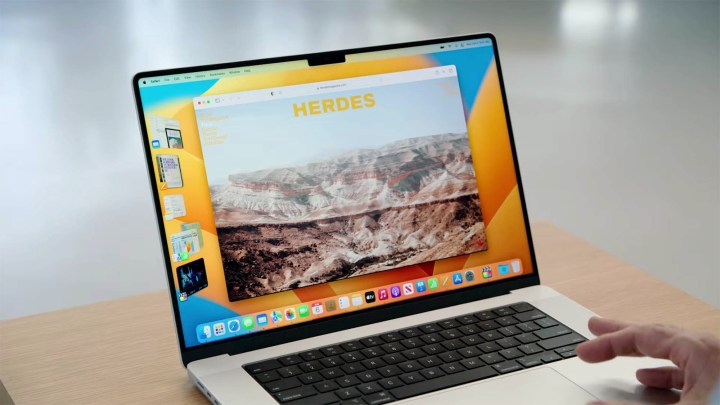
Apple unveiled the upcoming Stage Manager as part of MacOS Ventura during WWDC 2022. The feature, created to improve productivity and make it easier to switch between groups of apps, certainly seems like it could become a staple.
Although Stage Manager seems to be all-new, it seems that its concept has been around for much longer than we thought. According to an ex-Apple developer, Stage Manager was first created all the way back in 2006. How much has it changed since then?

The surprising peek into the past comes from TechReflect, a blogger with over 30 years of experience working in tech, and nearly 20 at Apple. The blog post sends us on a trip down memory lane, back to 2006, when a team of devs worked together on a project that went by the funny code name of “shrinkydink,” also referred to as “always-on exposé.”
The project was ultimately axed, much to the dismay of the developer, who continued to use it until it ultimately stopped working alongside new software upgrades. Even though “always-on exposé” was abandoned back then, it seems that Apple didn’t give up on the idea, seeing as it resurfaced in 2022, 16 years after it was first created.
As a quick reminder, Stage Manager is a productivity and window-management tool. We tried it out for ourselves, and even in its early beta version, it managed to impress us. It lets you group various windows together and have them sit on the left side of your screen, making it easy to switch not just between tabs in an individual app, but also entire groups of apps put together. More importantly, you can split the open windows of an app into different groups, such as using one Safari window in one group and another in a different group. Productivity-wise, it sounds like it could become a real game-changer once it makes it to the live version of MacOS.
As described by the developer who worked on the feature in 2006, “it was a radical new way to manage apps and windows and effectively made the existing Exposé irrelevant, as well as the Dock, as a way of managing running apps and windows.” This, word-for-word, sounds like a description of what the Stage Manager is capable of. This leads us to wonder just how closely related these two features are, and the answer is — they’re pretty close. Think siblings, not cousins, kind of close.
Let’s start with the similarities. Both Stage Manager and its much older sibling take over the positioning and size of all windows, making window management a lot simpler. Both of them also show groups of apps on the left side of the screen, and both let you view multiple apps all at once.

However, there are some changes, too. With Stage Manager, Apple got rid of something that “shrinkydink” provided — it displayed windows on the right side of the screen. Those windows weren’t the foremost in a grou,p but were still part of it. As such, you could easily swap between groups and windows within a certain group.
As shown by the screenshot provided by TechReflect, the visuals of both apps are very similar. Of course, MacOS Ventura from 2022 looks a lot more streamlined and softer than its older sibling, but the concept hasn’t changed all too much over the years, though Apple’s designs and aesthetic choices have evolved. The lack of windows on the right side of the screen marks the main difference between the two apps.
TechReflect’s blog post marks an interesting discovery and gives us an unexpected peek into how Apple works. Although 16 years have passed, Stage Manager finally saw the light of day — and it looks to be every bit as exciting as it could have been in 2006.
Editors’ Recommendations


