

HBO Now gave way to HBO Max, which later became Max—and now, Max is getting its HBO vibes back with yet another rebranding. This go-around is mainly about color changes, but it just might be the most successful rebrand yet for the streamer.
The very true, convoluted story of HBO’s brand transformation
Not long ago, HBO’s branding couldn’t be stronger.
Okay okay, to be fair, HBO still very much stands for prestige TV.
But when Warner Bros. decided to up the ante in its streaming play, the former HBO Now service became part of a much bigger offering.
That new player would combine HBO’s content with the vast WB library of classic films and TV shows to create a Netflix-class contender.
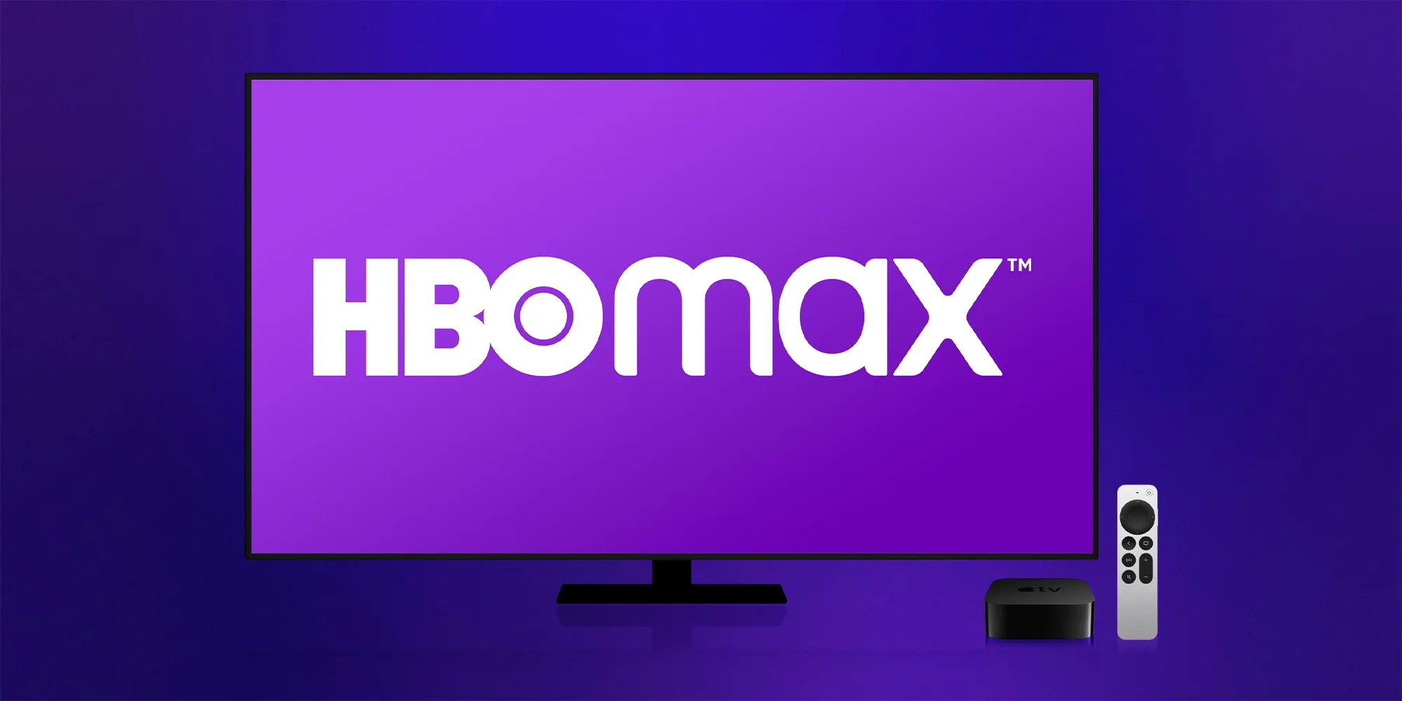
HBO Max was the new service. It dropped the classic black-and-white HBO look for a bold and distinct purple.
Except, that purple didn’t last. Nor did the name.
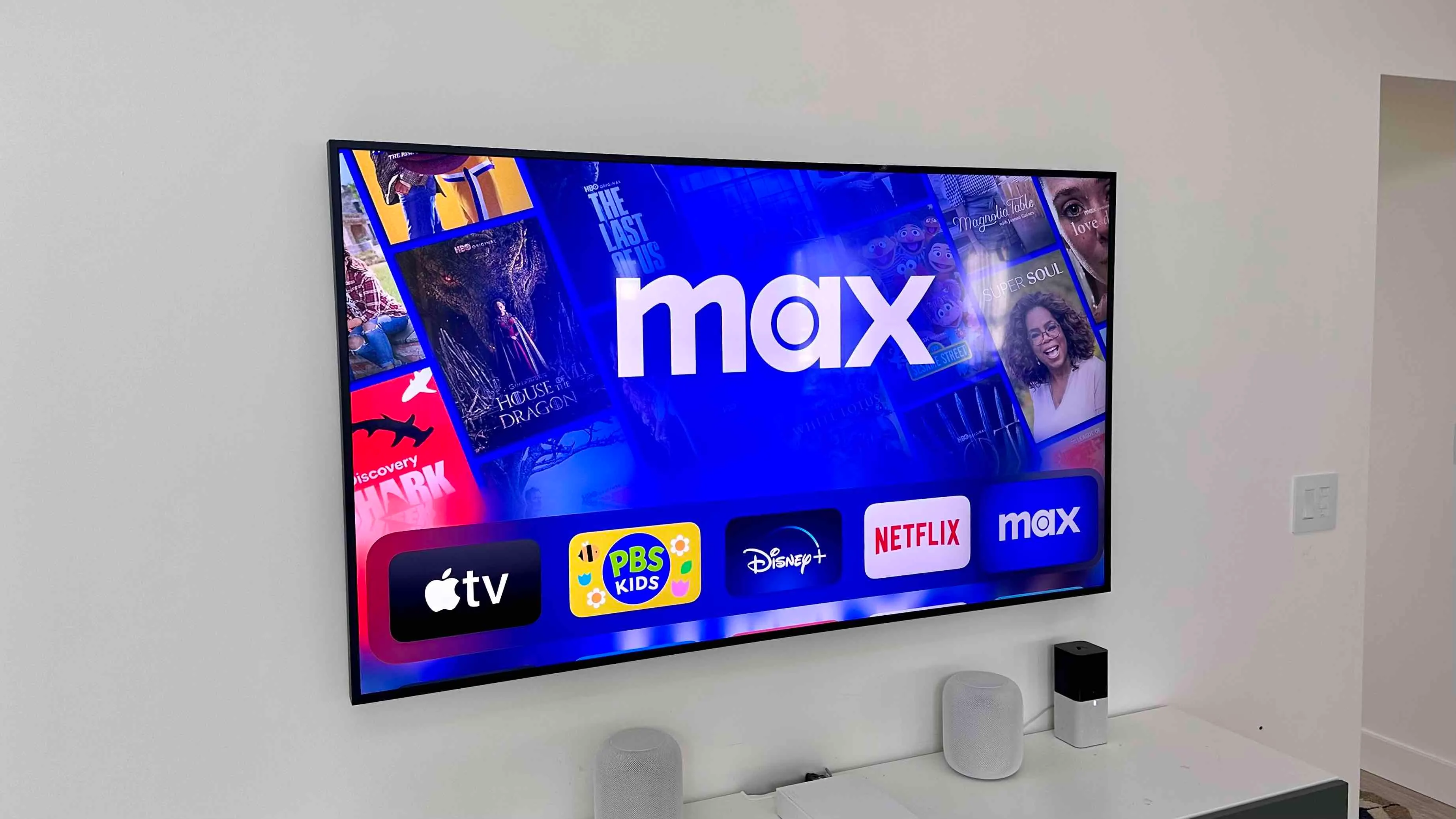
When HBO Max gained Discovery content after the Warner-Discovery merger, it rebranded again as just Max—and purple became blue.
Generally, public reception to all of these changes was a collective, “Huh?”
Why take one of the strongest TV brands—HBO—and dilute it?
Fortunately, I think the latest iteration of Max is the best yet.
Max now gives off prestige vibes without using HBO’s name
Max just launched a fresh logo with a new color scheme.
The name is the same, but now Max has a distinctly HBO-like logo.
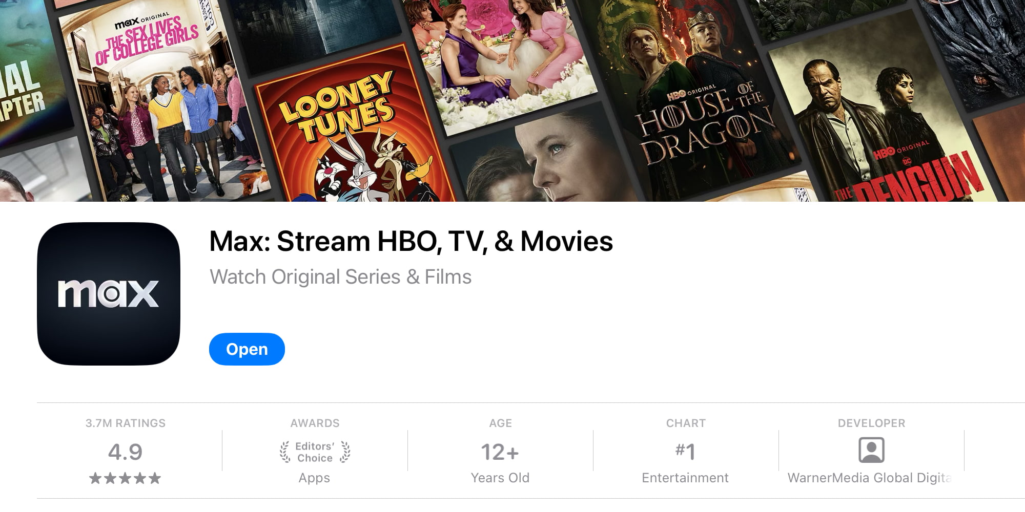
It joins Apple TV+ as the only big streamer to use primarily black and white-silver for its branding.
It took a few tries, but I hope this time around, the branding sticks.
Max already has name recognition. But now it gets to tap into the prestige HBO vibes without actually being called HBO.
And it shouldn’t be called HBO, since it offers so much more than just HBO.
Max, in HBO-style black and white, is a winner in my book. Somebody give the branding team at Warner Bros. Discovery a raise.
What do you think of Max’s new logo and look? Let us know in the comments.
Best Apple TV 4K accessories
FTC: We use income earning auto affiliate links. More.


