


Windows 11 is supposed to be better than Windows 10, and every design change is intentional. However, the last three years have shown that Microsoft was wrong with many UI changes, like the poorly placed All Apps section in the Start menu. Following in its footsteps, Windows 11 plans to bring back the old seconds clock in the Notification Center.
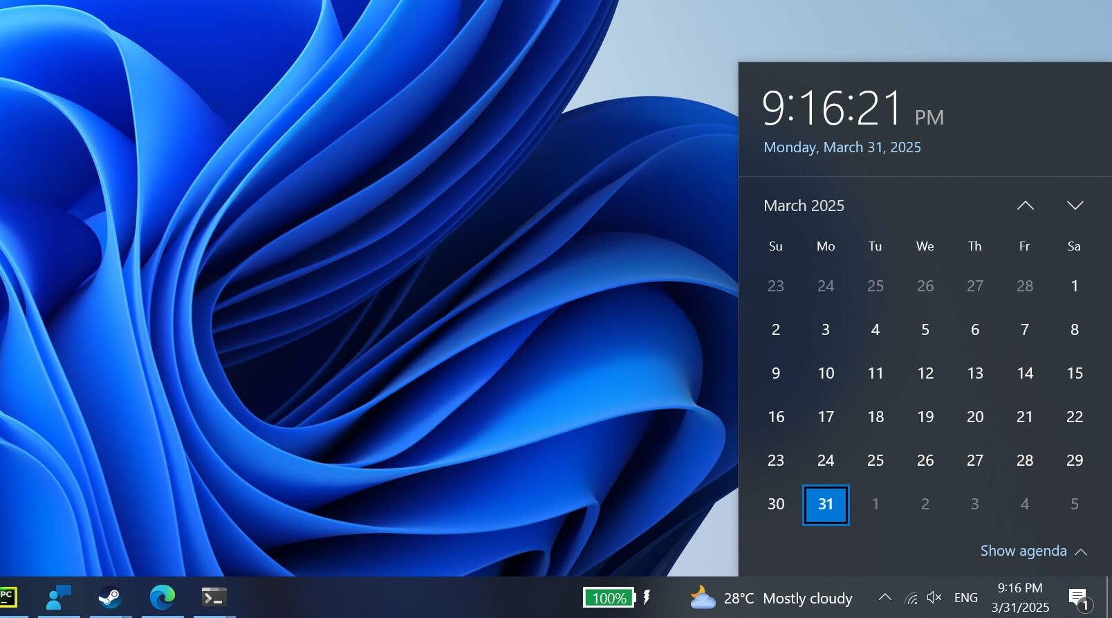
Windows 10 has a Calendar flyout that allows you to view events and the clock with seconds, but that’s missing in Windows 11. Microsoft shipped Windows 11 with Calendar Flyout and Notifications merged, but it doesn’t have the Clock that would let you quickly glance at the exact time.
However, instead of making Windows 11 better, Microsoft recently removed Clock with seconds from Windows 10 Calendar Flyout without telling us “why.” We don’t know if the old full-fledged Calendar flyout will return to Windows 10, but in a surprising move, Microsoft is bringing back Clock to Windows 11’s Calendar Flyout.
I’m not a conspiracy theorist, but it almost seems like Microsoft deliberately pulled the feature from Windows 10 just to add it to Windows 11. Maybe to market it as an upgrade later?
As noted by Phantom on X, Windows 11 preview builds have reference to the “Show time in Notification Center” option.
Windows Latest was also able to confirm the reference in our own tests.
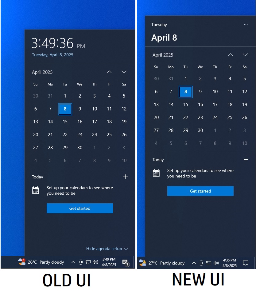
This is a really nice change, and Microsoft should have never removed the Clock from the Calendar Flyout in Windows 11. If you don’t remember the Clock inside the Calendar Flyout, take a look at the below screenshot from Windows 10:
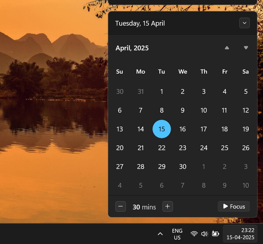
We don’t think Microsoft will put such a gigantic clock in the notification center because it doesn’t align with the overall Windows 11 design. However, we expect it to be big enough to be different from the other notification center elements. The clock must stand out and could adopt a bold font style.
Windows 10’s loss is Windows 11’s gain
As mentioned above, Windows 10 recently got rid of the clock in the notification center and replaced it with the date and day display.
The new design is terrible because it doesn’t let you quickly view the clock in seconds.
Also, it doesn’t even clearly mention the date and the year. We hope Microsoft will stay away from this idea for Windows 11’s notification centre. Still, it’s not the only design experiment system tray has had this year.
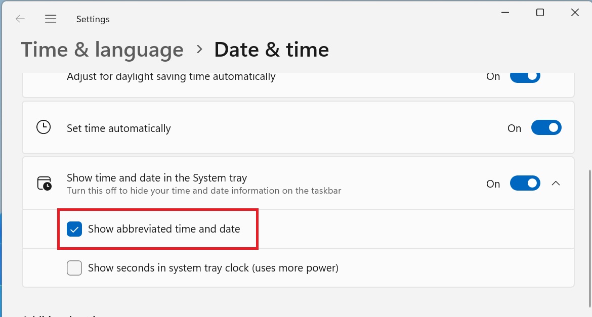
Shortened date and time is coming to Windows 11
In Windows 11 24H2 experimental builds, you can pick a shortened version of the date and time to appear in the system tray.
It saves some space and looks cleaner than showing the entire date and time in such a small area. You also have the option to hide the notification bell icon, decluttering the system tray.
Briefly, Microsoft played with the idea of a Copilot app icon next to the clock in the system tray and even hid the show desktop button, causing mass panic.
But since Copilot became a full-fledged app, that absurd design was withdrawn, leaving you with a cleaner system tray.


