

- Windows 11 has a redesign of the Start menu incoming
- Microsoft has shared info on the process of that revamp and how it took in a wide range of feedback
- We also get to see some of the abandoned designs for the Start menu
Windows 11 is getting a major revamp for the Start menu and in an interesting move, Microsoft has shared the feedback which drove that redesign, as well as some of the concepts that fell by the wayside.
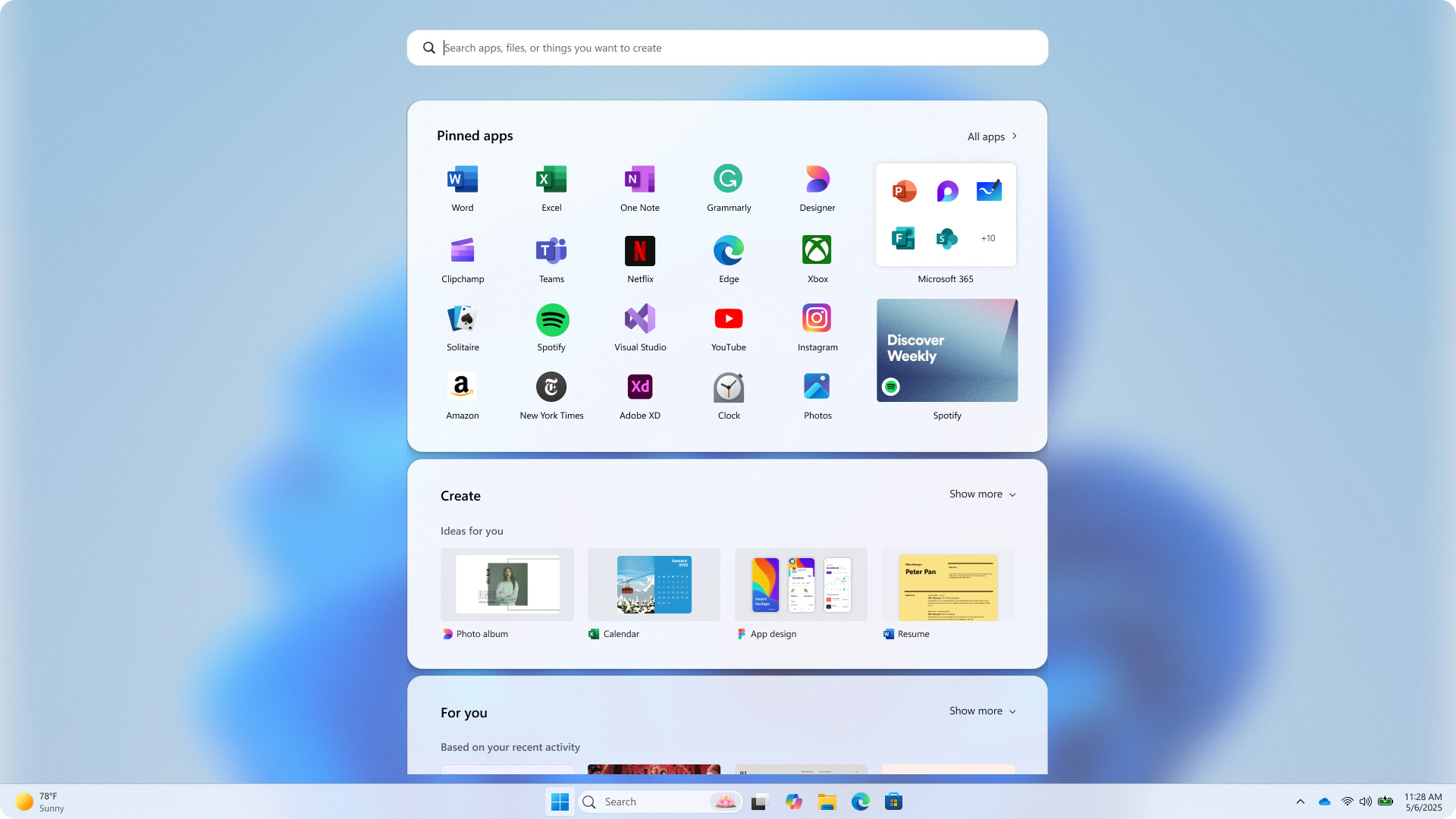
In case you overlooked the emergence of that Start menu overhaul, Microsoft gave us a first look at it recently. Essentially, it changes the menu into a single scrollable panel (rather than two separate efforts) and applies some other useful tweaks.
Broadly speaking, I’m a fan and I think it’s a clear step forward (more so now that a point of doubt has apparently been clarified, and I’ll come back to that momentarily).
Windows Central picked up on the blog post Microsoft published about the process of redesigning the Start menu, explaining why the new layout was chosen, and also looking at other treatments that were discarded based on user feedback.
Indeed, Microsoft says it combed through a whole lot of notes on the Feedback Hub (where testers and enthusiasts give their opinions on Windows 11) as well as conducting “thousands of remote interviews” in order to get the redesign of this part of the interface right. On top of that, we’re told: “Over 300 Windows 11 fans joined unmoderated studies and dozens more hopped into live co-creation calls.”
Apparently, from all this, a key message repeatedly came through from those people: “Help me find my apps faster. Let me bend Start to fit the way I work. And please – keep the magic, don’t lose the soul.”
Yes, I’m guessing the final part of that quote was never something Microsoft heard – it sounds more like something Freddie Mercury sang in a Queen song back in the eighties – but the first two points fully make sense. Windows 11 users want the Start menu to be, most of all, the place where they find and fire up their apps, and a part of the interface that they can customize.
I think the latter is a particularly crucial factor, and elsewhere in the post, Microsoft talks about the Start menu providing: “Recommendations made just for you that learn in real time and a way to hide them if you don’t find them helpful.”
Regarding the second half of that sentence, I take this as confirmation that Microsoft is indeed incorporating a switch to remove the recommendations panel from the Start menu entirely, for those who don’t want it.
I don’t, and I know I’m not alone in that, and this option was spotted in testing with the Start menu revamp. So, this comment about giving users a ‘way to hide’ recommendations surely refers to turning them off. For me, this represents indirect confirmation that a key part of the redesign is indeed coming.
It’s also good to see Microsoft becoming more transparent here, and showing off the discarded Start menu concepts, too. Are any of them any good? Obviously, this is a subjective matter to an extent, but for me, some of them definitely deserved to be chucked in the bin, while others seem sensible enough.
Let’s take a look at the candidates which stand out from the efforts that ended up being dumped.
This is a more tablet-focused take on the Start menu (where the background is blurred out), although that’s not going to be ideal for traditional desktop PCs (obviously). I don’t like that it takes a step back in terms of still having the ‘All apps’ list as an entirely separate panel. It’s quite a clean layout to be fair, but there is some suggestion-related stuff here that I’m not so keen on. Pass.
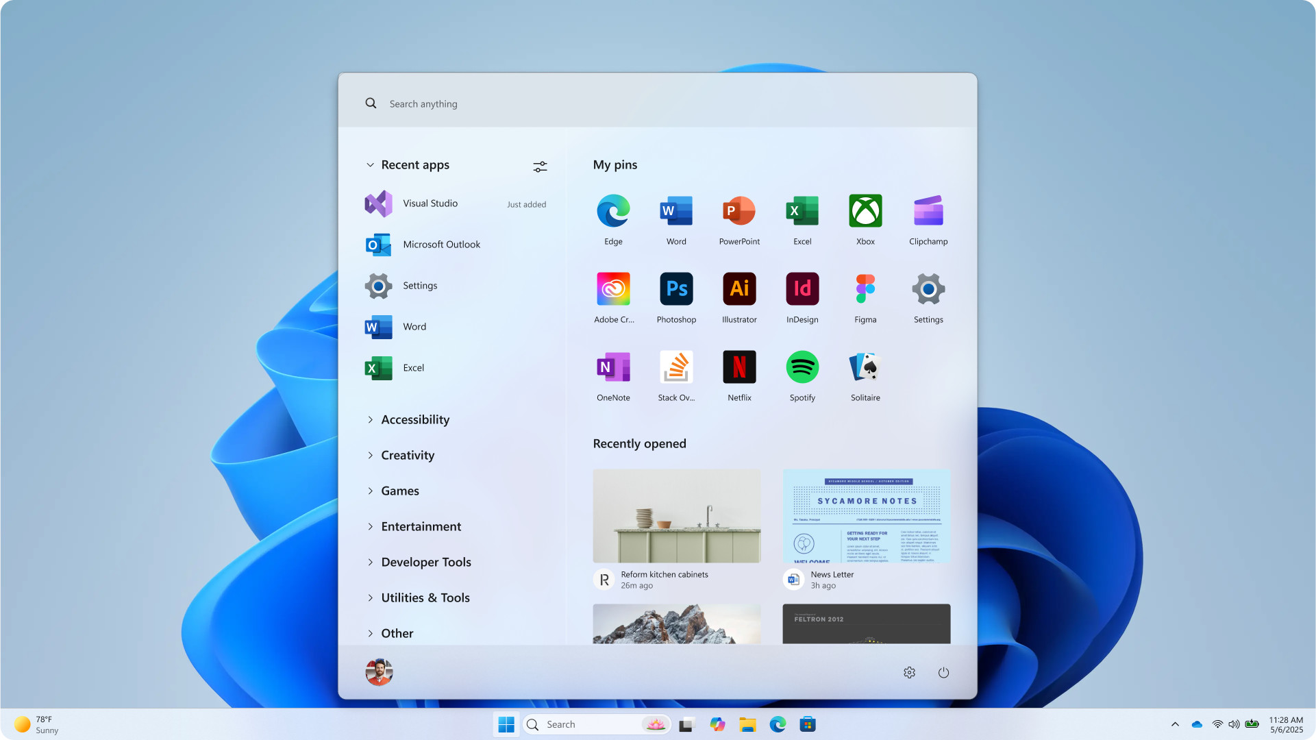
Essentially, this is the Start menu from Windows 10 ported to Windows 11, although the design elements kind of clash for me (the category lists for apps, bottom-left, feel particularly out of place). Despite it all feeling shoehorned into Windows 11, I don’t mind the idea of just having the Windows 10 Start menu back in some ways. I’m surprised Microsoft even considered the idea, though.
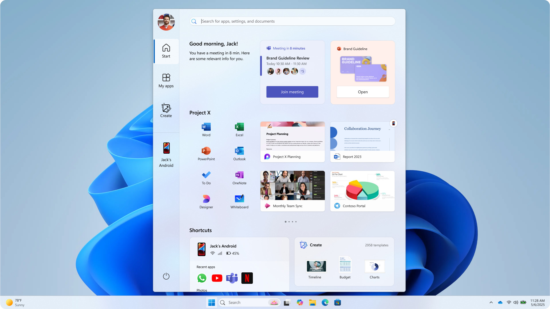
Erk, what is this? It looks like someone’s lobbed a hand grenade into the guts of Windows 11’s Start menu, and this is the aftermath of the almighty explosion – bits of interface all over the place. It’s too busy, suggestion-heavy, and again like the first concept above, it grows limbs and splits off other sections into separate panels. No thanks.
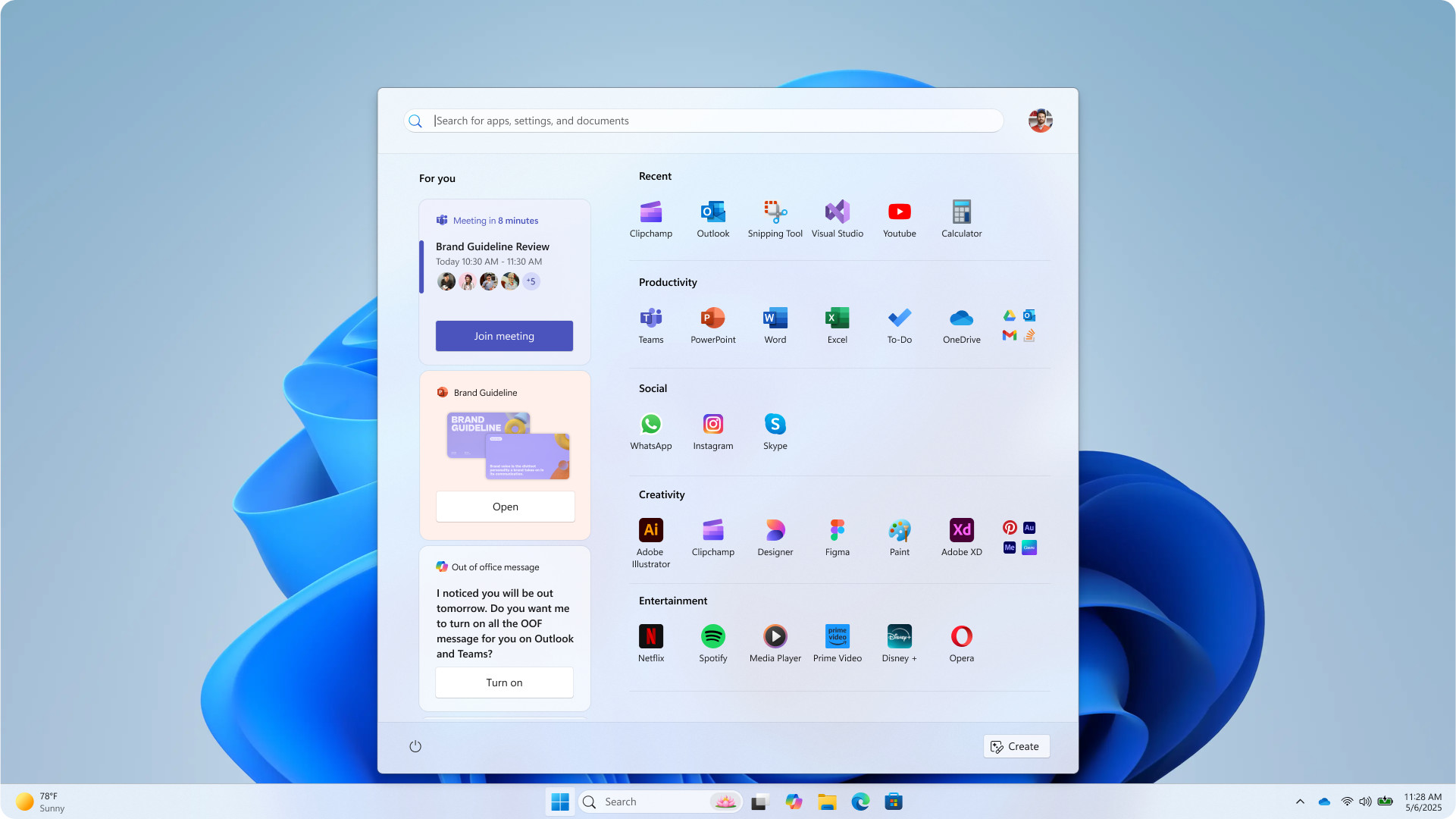
This one I quite like – it keeps things simple, and it’s mainly focused on the apps, with some recommendations and reminders in the left panel. Note that Copilot has crept into the reminders, bottom-left, but overall, I think this is my favorite of the abandoned designs.
However, the Start menu redesign Microsoft has chosen is the winner for me, although you may well have a different opinion (Windows Central certainly does). Why? Because it keeps things simple, with everything on one panel, and the new category view for the full list of apps ensures that’s more tamed – plus you can (hopefully) drop the recommendations panel to make more space, too. (Worries about Phone Link have been swerved as well, with a simple button to retract the panel, for those who use this app).
Is Microsoft’s chosen revamp too boring? Well, yeah, maybe. I guess it is the safe, not overly adventurous option, but it works for me. I don’t want a fancied-up Start menu. I want a functional one, a streamlined system, and yes, that crucial ability to customize and further trim anything I don’t need (while those who like recommendations can have them).


