Expert’s Rating
Pros
- Tiny
- Super-thin
- Functional, techincally
Cons
- Hard to use as a keyboard
- Hard to use as a touchpad
- Integrated stand isn’t great
Our Verdict
Combining a touchpad and a keyboard into the same device is a novel idea, but the implementation leaves a lot to be desired. Like another keyboard and another touchpad. Avoid this gadget.
Price When Reviewed
This value will show the geolocated pricing text for product undefined
Best Pricing Today
Best Prices Today: Mokibo Fusion keyboard

$89
Mokibo fusion Universal Keyboard
$109.90
If you spend a lot of time on your phone or tablet, perhaps you’ve played around with the idea of turning it into a full mobile work machine, effectively replacing a laptop. Perhaps you’ve already done that! In either case, you’re probably interested in getting your setup down to the barest essential hardware possible to achieve everything you need to do. And for that type of user, the Mokibo Fusion may present a pure, platonic ideal of pint-sized productivity.
Further reading: Best wireless keyboards 2024: Top Bluetooth and USB models
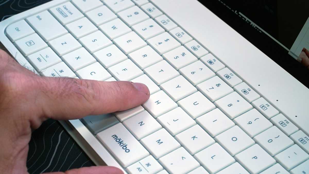
The Mokibo is, in short, a keyboard and a touchpad in one. The surface of the keys on the Bluetooth keyboard are touch-sensitive, allowing you to run your finger along them to simulate a mouse movement as you’re no doubt used to on a laptop. It’s an intriguing idea, which combined with the truly tiny dimensions of the mobile keyboard, give it the potential to be a mobile game-changer.
Michael Crider/Foundry
The potential, but sadly not the reality. In trying to use the Mokibo as intended, I found the experience iffy at best, downright infuriating at worst. The space and weight it certainly saves versus a travel keyboard and mouse combo just aren’t worth dealing with the awkward implementation of this unique but flawed gadget.
I found the Mokibo Fusion iffy at best, downright infuriating at worst.
Mokibo Fusion: As a keyboard
The Fusion feels like both a quality piece of kit, and a bit of a throwback. I like its integrated cover that functions as a power button (turning on automatically when you open it) and as a tablet or phone stand when folded out. The materials are solid, if not amazing, coming in a soft-touch plastic white on the review unit.
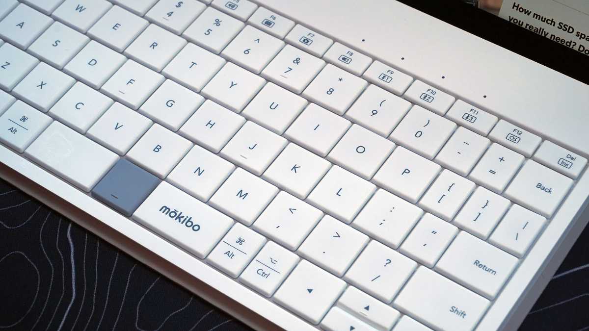
The layout is fairly standard compared to a laptop keyboard, though it is significantly tightened on the left and right, sized to match a typical iPad (like my 4th-gen Air) with a 9.25-inch, 235mm key space. Compare that to 10.75 inches or 275mm on my work laptop. It squishes a bit, but notably never on the primary alphanumeric keys. The layout is similar to Apple’s official keyboard for its 11-inch iPads, or Logitech’s Keys to Go 2, complete with squashed Function row.
Michael Crider/Foundry
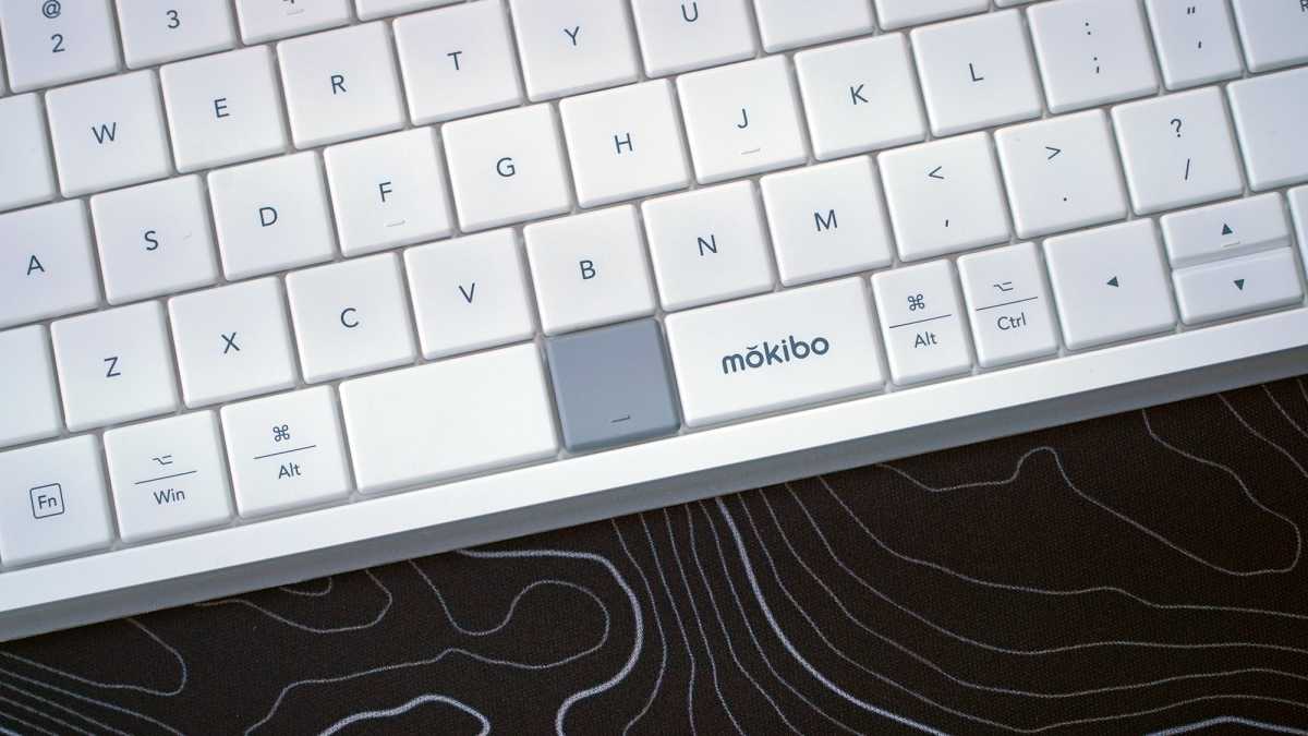
The exception is the spacebar, or rather, bars. They’re split into three sections, with one central button working as the primary mouse click. You can right-click with the Fn button, though there are other options we’ll explore later. The left and right space bars, the latter with the Mokibo logo, are well-spaced for naturally hitting with your thumb without accidentally pressing in the center.
So how could something so new and advanced be a throwback? It’s all in the feel of the keys. The layout may feel familiar, but the keys themselves are all spaced only a millimeter or so apart. It feels like a laptop keyboard from at least 15 years ago, before some extra spacing (what was called “chicklet” or “island keys” at the time) became the norm. The reason for this seemingly old-fashioned choice is obvious, or will be shortly.
That being said, I can suddenly see why every laptop and keyboard maker switched over to island keys at around the same time, even brands like Lenovo’s ThinkPad that place such a heavy emphasis on typing. Going back to this old-fashioned layout, I found myself struggling to type accurately, as apparently my fingers have gotten very used to a little extra padding. Combined with the cramped keys on the side, particularly for things like an apostrophe (which I often miss for a semicolon or the Return key), it’s a pretty huge shift.
Michael Crider/Foundry
It’s not insurmountable, but if you’re used to a standard-sized keyboard and/or you switch between this smaller layout and a regular one frequently, it can be very jarring. This cramped layout and tight key spacing isn’t helped by the fact that the keyboard just isn’t very comfortable to type on. It’s perfectly flat, no raise or angle at all, and the keys are shallow and squishy. Compared to the Logitech Keys to Go 2, which I adapted to rather quickly, it’s a struggle.
The larger version of the Fusion for the 12.9-inch iPad might alleviate at least some of these problems. But as I type these words on the keyboard itself, I really can’t wait to be using almost anything else.
Mokibo Fusion: As a touchpad
On a technical level I can appreciate that building physical keyboard that doubles as a touchpad is an impressive achievement. But actually using it as one is, well, a chore. I tested the Fusion on my Android phone, my iPad, and my Windows desktop. And for all three of them I found it an almost painful experience.
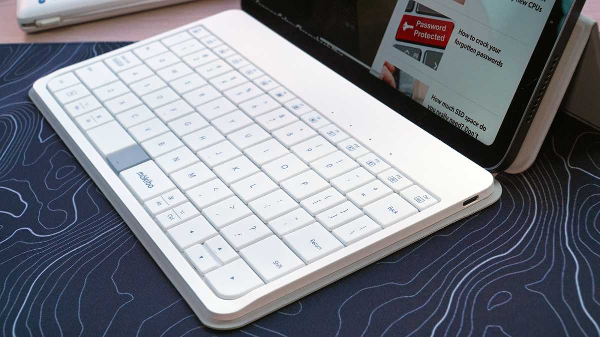
The touch-sensitive keys can work as one giant touchpad, apparently using the center four rows and all but the extreme left and right keys. That makes for a massive tracking area, bigger than any laptop touchpad I’ve seen. It’s also capable of tap-to-click, smart enough to tell left from right clicks (no need to use that center space bar button if you don’t want to), and can handle basic multi-touch gestures. Two fingers to scroll, three fingers to switch tasks, et cetera.
Michael Crider/Foundry
It’s pretty cool to run your fingers across apparently normal keys and see a cursor move. But very quickly you encounter a fairly serious flaw: You have to do so without actually pressing any of the very thin, very shallow keys. This is doable with a bit of practice — again, I’m reminded of an older laptop design transition, back when every brand was incorporating trackpads that could be physically clicked instead of relying on dedicated mouse buttons. But it’s one more thing that requires adaptation on the part of the user.
As a trackpad, the Fusion just doesn’t feel very good. Despite the large physical area for moving the cursor, it’s picky and sometimes jumps around… as you might expect for a trackpad that’s physically broken into multiple zones. It’s usable, but a far inferior experience to a dedicated trackpad.
And that’s before you account for the fact that this is the same surface you’re expected to type on, at the same time. On an extremely regular basis when using the Fusion, I’ll activate the cursor when typing or, less frequently, type when using the cursor. Just a moment ago I managed to delete an entire paragraph without meaning to.
Michael Crider/Foundry
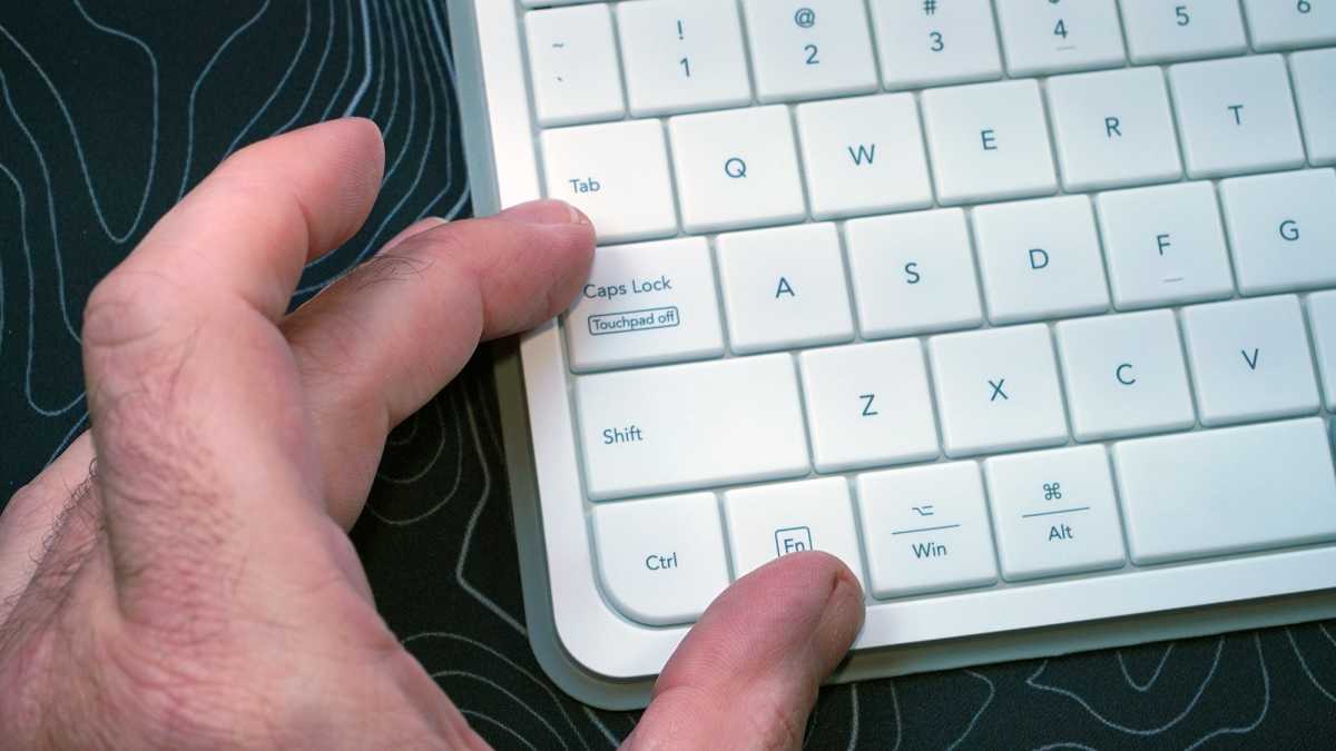
You can alleviate at least some of these issues by pressing Fn + Caps Lock, which disables the touchpad functionality. At that point the Fusion is “just” a keyboard… a small, uncomfortable one. It’s a less frustrating way to type long strings of text, but essentially defeats the purpose of having this combined keyboard-and-touchpad device.
I wonder if the designers stopped to ponder, “if we need a dedicated function to disable the touchpad to make typing easier, should this keyboard really be a touchpad too?”
Mokibo Fusion: Other shortcomings
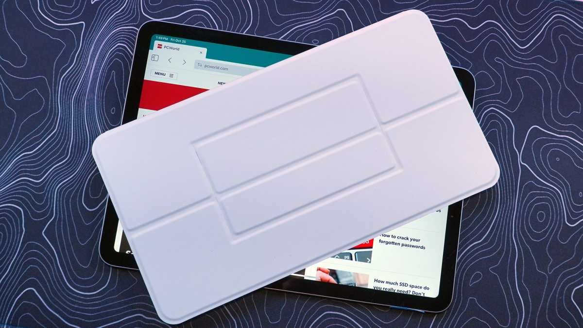
When closed, the Fusion is wonderfully light and compact, basically disappearing in a bag or even a (very large) pocket. It’s undeniably cool as a companion to my iPad or Galaxy Fold. Unfortunately the cover’s secondary function as a tablet or phone kickstand leaves a lot to be desired.
Its magnetic fold has only one stable position. And that is a very unnatural one to me, way too vertical for a tablet screen. The lack of options made me resort to my more dependable stands, a Moft folding magnetic stand for the tablet and this Magsafe kickstand thingy for my phone.
Michael Crider/Foundry
But this meant tucking the cover under the Fusion keyboard, making typing even less comfortable, or simply letting it hang out beneath the tablet or phone, a cumbersome appendage when actually trying to type.
I appreciate that this is coming off as an extremely negative review, but the truth of the matter is that I just don’t see any situation where I’d actually prefer using the Fusion. It really only makes sense for a phone or tablet, but it’s only a so-so keyboard and a downright janky touchpad. Trying to use it as both at once, without the aid of that Fn+ Caps Lock tool, is just incredibly frustrating.
Michael Crider/Foundry
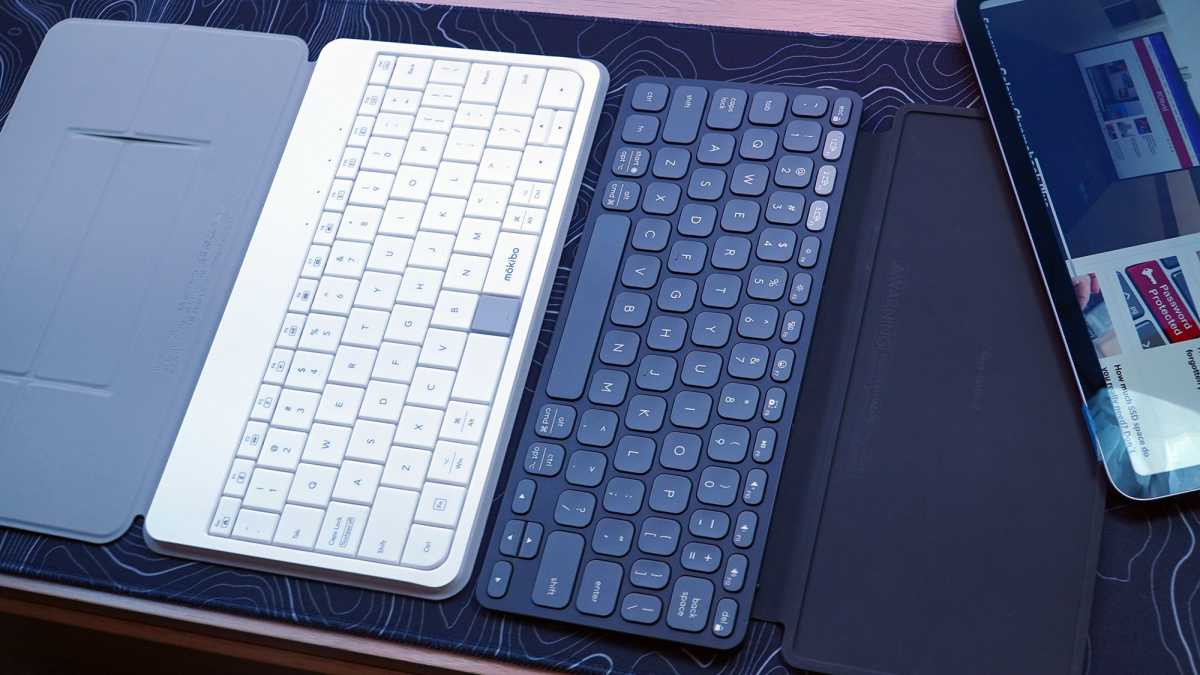
Since you’d almost certainly be using the Fusion with a device that already has a touchscreen, it’s more precise and less frustrating to just…touch the screen. Combined with a travel keyboard or case, you really wouldn’t save any weight or space with the Fusion, and many of the options for the iPad or even universal cases have plenty of vertical space for the touchpad anyway.
combining a keyboard and a touchpad makes one device that’s pretty bad at being both of them.
After having tried the Fusion for several weeks, I’d go with the Keys to Go 2 and a small mouse in just about every situation. Or frankly, go without the mouse and use the touchscreen. The Fusion is an interesting idea, but I think it probably would have been better to leave it on the drawing board. In practice, combining a keyboard and a touchpad makes one device that’s pretty bad at being both of them.


