Samsung has been known for taking inspiration from the iPhone, but it’s usually for the best. However, with the Galaxy S25 and One UI 7, Samsung borrowed from one of the iPhone’s biggest weaknesses: notifications.
Many long-time iPhone owners can admit that notifications are not Apple’s strong suit. Android, on the other hand, has excelled with notifications from day one. They’re simple yet powerful and flexible enough to fit your individual needs. So why on Earth would Samsung adopt some iOS-style notification features? Let’s take a look at what they did.
Stacked Notifications
One of the most noticeable changes in One UI 7 is the shift to “stacked” notifications from the same app. Android does group notifications from the same app together, but it’s usually a list of subject lines on one card–as seen in One UI 6 in the first image above. This way, you can see multiple notifications without expanding the card.
As you can see in the second image above, iPhone notifications are grouped together as cards in a stack. So, if you have multiple Gmail notifications, for example, you can only see the most recent email before expanding. This is exactly how it now works on One UI 7, as you can see in the third image.
The iOS style is simply far less efficient. Previously, I could see multiple notifications from an app grouped together in a nice, compact card. There was no need to expand the card unless I wanted to take action on one of the notifications. Now, I have to expand the stack every time just to see what’s all there.
Notification Channels Turned Off
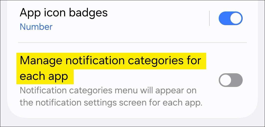
Perhaps the most baffling change is the disabling of notification categories (or “channels”) by default. Android’s notification categories are what makes them so powerful. It allows you to control which types of notifications you receive from each app.
One big annoyance with iPhone notifications is a lack of fine controls. In the system settings, you get an all-or-nothing toggle, and you have to hope the app itself has more options. But on Android, you’re supposed to be able to toggle categories from the system settings, and most apps have supported this for years. It’s very odd to turn this off as an out-of-the-box experience.
Lock Screen Notifications Hidden
If there’s one area where iPhone notifications especially struggle, it’s the lock screen. When you unlock an iPhone, you immediately see “Recent Notifications.” But the next time you unlock the screen, they’ll be gone, moved out of sight to the “Notification Center.” So, you see an emtpy screen like the first image above even though you do have notifications..
Thankfully, Samsung hasn’t gone far enough to copy the iPhone’s weird approach for lock screen notifications, but it did make them a lot less visible. The Galaxy S25 defaults to only showing notification icons in the status bar on the lock screen (second image). This is fine as an option, but making it the default threw me for a loop at first. In previous versions of One UI, the icons were more prominently placed under the clock (third image). The Galaxy S25 felt like I didn’t see notifications on the lock screen at all.
Notification Panel and Quick Settings Separated
Finally, the notification panel and quick settings have been separated. This change, in particular, feels like a direct copy of the iPhone’s Notification Center (first image) and Control Center (second image). It works exactly the same on the Galaxy S25: swipe down on the left side of the screen for notifications (third image) and swipe down from the right side for quick settings (fourth image).
Technically, there’s nothing wrong with this once you get used to it, but it’s not as good as Android’s default behavior, which gives you a few quick toggles and your notifications in one panel (fifth image). It’s like using a royalty-free knock-off version of a song when you already own the original. It’s always felt like Apple’s implementation was built within the restraints of not copying Android. Samsung is essentially defaulting to a second-rate version of a feature that already exists on the phone.
These changes feel like a significant departure from what makes Android great. By mimicking the iPhone’s notification system, Samsung is adopting some of its worst aspects. Thankfully, unlike the iPhone, Android has always been about customization and control so that you can revert most of these decisions. I just wish they weren’t the new default.


