I’ve swapped out the default home screen launcher for an alternative ever since I started using Android. Samsung’s 7th version of One UI, currently rolling out to Galaxy phones, is the first I genuinely like.
The ability to completely change how the home screen looks, and functions have long been a big part of why I chose to use Android in the first place. Yet so much attention has been paid to all the little details in One UI 7 that this time, I’m leaving my phone just as it is.
These Are the Most Fluid Animations I’ve Seen
When you tap on an app in One UI 7, the app icon fluidly grows larger and merges into a fullscreen app window. When you return to the home screen, the app window shrinks back down into the app icon if it’s an icon visible on your dock or your current background. The same happens whenever you tap on a widget or interact with any of your quick settings. Even the volume toggle flows with more harmony as you adjust sound.
If you’ve been using a Google Pixel phone, this may not sound that special. Google has done a good job with animations for quite a while, and that’s easily my favorite thing about them. Phone makers in general are stepping up their game in this area, and with One UI 7, Samsung hasn’t just caught up—its development team has knocked it out of the park.
I Love the New Icons
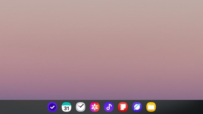
The icons above are the ones currently pinned to the dock in my Samsung DeX desktop. I adore them.
App icons can feel like a small thing, but they’re reason enough to install an alternate launcher. If I don’t like an app icon I have to see every day, and the default launcher doesn’t let me change it, then I’ll look for an alternative that will.
Related
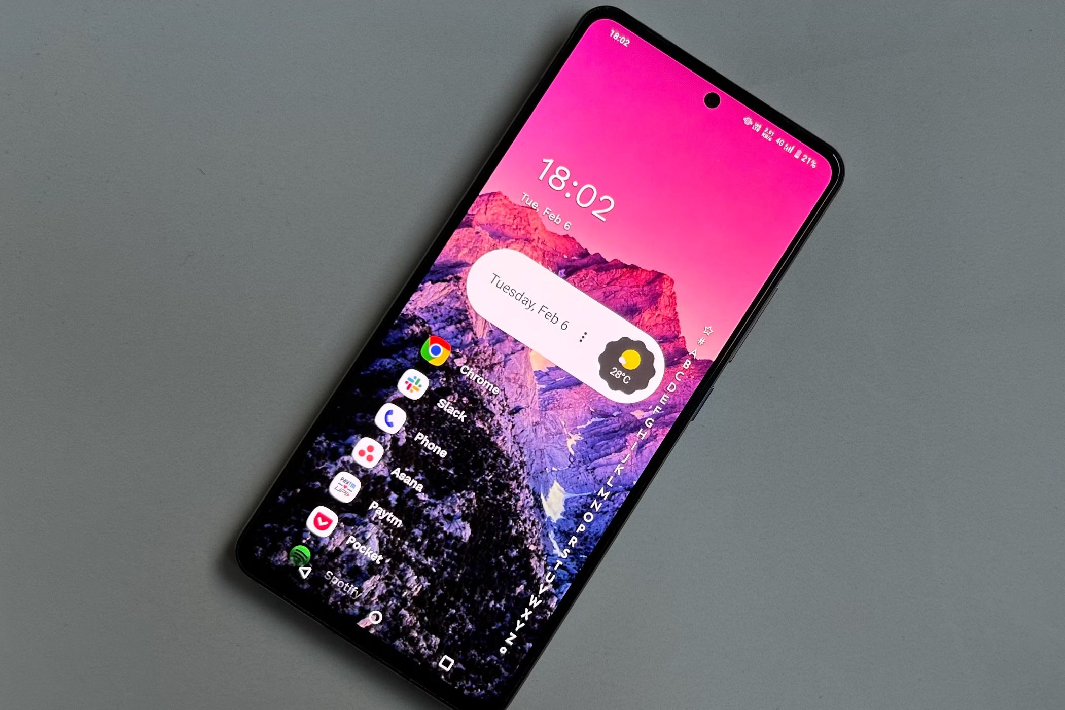
Freshen up your home screen experience with these featured-packed Android launchers.
Samsung doesn’t have control over the icons that third-party app developers create, but as for the first-party icons, I appreciate their new look. As someone who likes many of Samsung’s apps, these are icons I interact with often.
App Folders Look Better When They’re Big
App folders appear when you group two or more apps together on your home screen. Typically, the folder’s icon remains the same size as any other app icon. Now there is an option to enlarge folders, turning them into a widget with several app icons inside that are now big enough to launch without having to open the folder first. It’s a way to group icons together without slowing down your access to them.
I don’t generally save icons to my background, but when I do get the urge, this is precisely the way I want to do it.
I’m digging the set of widgets that come baked into One UI 7. Many of my regular apps not only have a widget, they have multiple widgets to choose from. For example, I have a choice of how I want to view my calendar: choosing a monthly view that’s mostly for looks, going with a functional daily agenda, or a widget that combines both.
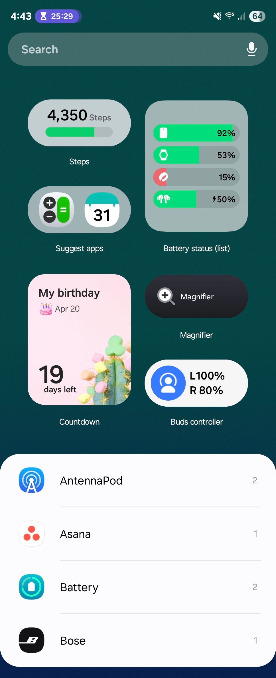
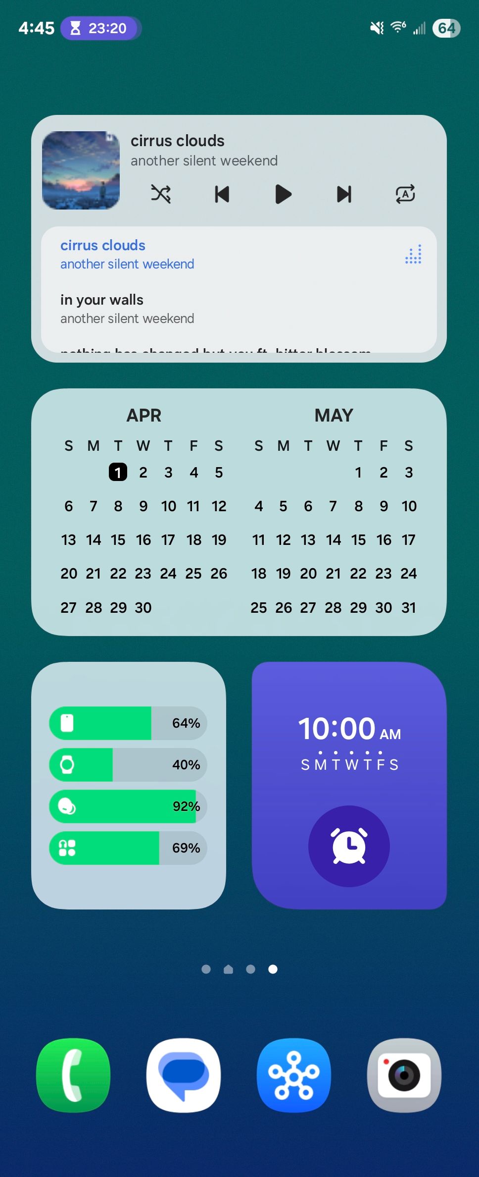
There are ways to see the current weather, widgets that show my daily energy score or how well I slept, media playing widgets, a way to see the current battery levels of my devices, and so much more. As a heavy Samsung Notes user, I now have certain notes saved directly to my home screen so that I don’t have to find them within the app.
It’s not the options that make the difference, since many of these widgets were pre-existing and haven’t functionally changed. It’s the rounded corners. It’s the transparency and the degree to which I can edit their appearance. It’s the vibe.
If there’s one difference that has stood out to me between the Android implementation of widgets and the far more recent iPhone implementation, it’s the attention paid to spacing. Android widgets have long felt to me like widgets just scattered about on a home screen. iPhone widgets are sized to fit into the home screen’s standard grid and spaced apart accordingly.
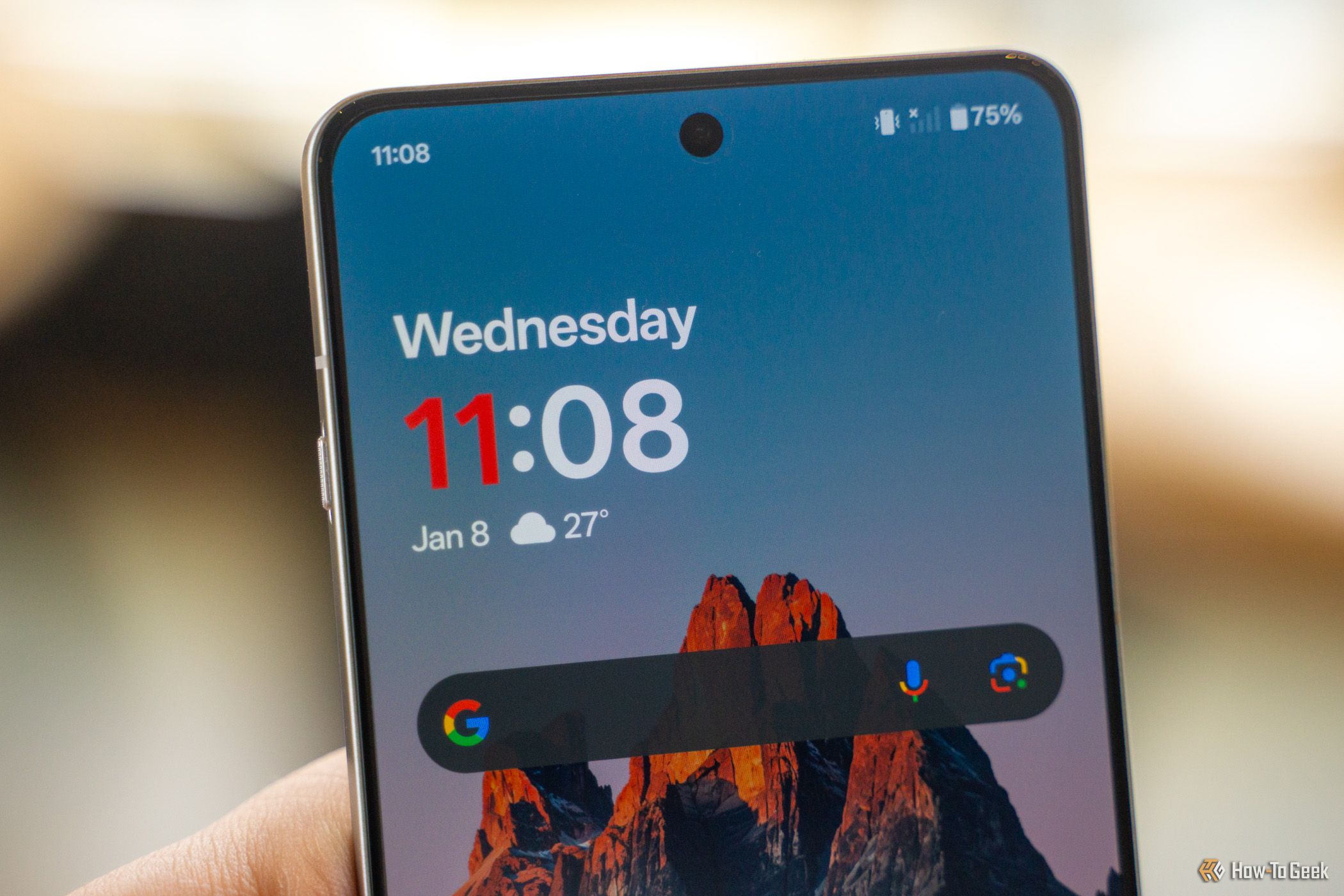
Samsung’s widget placement on One UI 7 feels most of the way there. The company’s first-party widgets are on point. Third-party widgets are more hit or miss, but thankfully, the Play Store is now making widgets easier to find.
Related
Can’t Find Android Apps With Widgets? Google Wants to Fix That
The Google Play Store will help you find more apps with widgets.
A Vertical App Drawer Makes All the Difference
Add me to the list of people who never really cared for Samsung’s previous paginated app drawer. Instead of a list of apps, you had to swipe left and right between pages. Samsung didn’t create this approach. Early versions of Android arranged apps in pages that you swiped horizontally the same way.
Thing is, stock Android switched to a vertical scrolling app drawer ages ago. Most Android phone makers made the change way back when. I’m glad Samsung has finally followed suit.
A New Taskbar Pops Onto the Scene
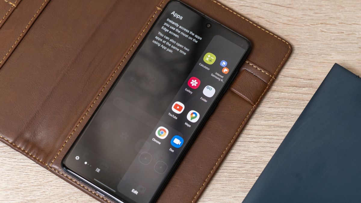
I use a Galaxy Z Fold 6. On older versions of One UI, these book-style foldable phones come with a taskbar that lines the bottom of the screen, like a Windows PC or Chromebook. Now Samsung has swapped this out for a dock that you can access by swiping up from the bottom.
I prefer the look of this dock over the old one. For anyone already familiar with Samsung’s edge panels, it feels functionally the same, only across the bottom of the screen instead of a side and without a visible handle.
Related
How (and Why) to Use Samsung Edge Panels on a Galaxy Phone
Another useful Samsung phone feature you may not know about.
I’ve used Niagara Launcher for quite a while now, and before that, Nova Launcher was my go-to for years. I’ve dabbled with some experimentation takes along the way, such as the Kvaesitso launcher only available on F-Droid, which I used to help turn a smartphone into a minimalist dumbphone. It feels weird to actually stick with the launcher that comes with my phone, but here we are.
I love the work Samsung’s team has done here. One UI flows so well from my phone’s cover screen to its larger internal one, my lapdock running DeX, and the interface on my Frame TV that the design really is starting to live up to its name.
