The problem I wrestle with isn’t really information overload, but information fragmentation. A new update to Slack’s UI addresses this, but I’m not sure it can solve it.
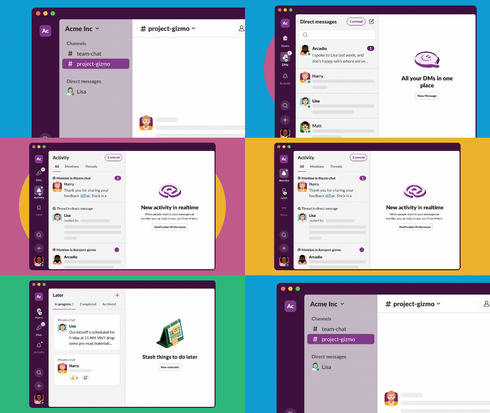
Slack is outlining its new user experience today, which will begin rolling out to organizations and teams over the next few months. The new UI reminds me more of a traditional inbox: one place for your messages, a place for your relevant info, and a general location for tasks and conversations that you set aside for the future.
What Slack is trying to do, though, is at least consolidate where all of these messages reside. Maybe your current Slack configuration includes multiple workspaces, Slack’s name for business- or department-wide collaboration. Today, you need to constantly bounce between those. Slacks update still allows you to go back and forth, but not if you don’t want to; instead, you can pull in messages from multiple workspaces.
Slack’s making a similar change in direct messages, too. Today, DMs require separate conversation threads — and in my Slack, there’s always a few more people that I frequently chat with, so that I’m constantly having to manually create new Direct Message threads. Slack’s promising to allow you to create a “unified inbox” of DMs, opening up the thread in a separate column.

Slack
You’re going to see something similar in a new Activity feed, which looks a bit like Slack’s Threads feed does now. (That’s shown off in the image at the top of this article.) Activity is going to be where Slack tries to bring in all the things that may be relevant: direct mentions in conversations, or when someone replies to something you said. There might be instructions by someone who manages you, or a query by a colleague.
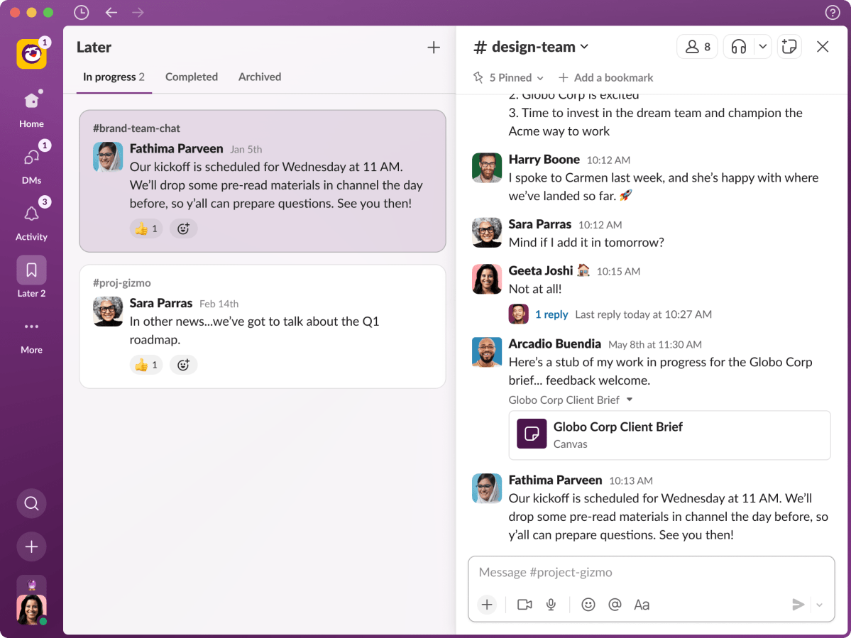
Slack is also allowing you to essentially kick the can down the road with a new Later tab, too, which essentially flags a conversation for later action.
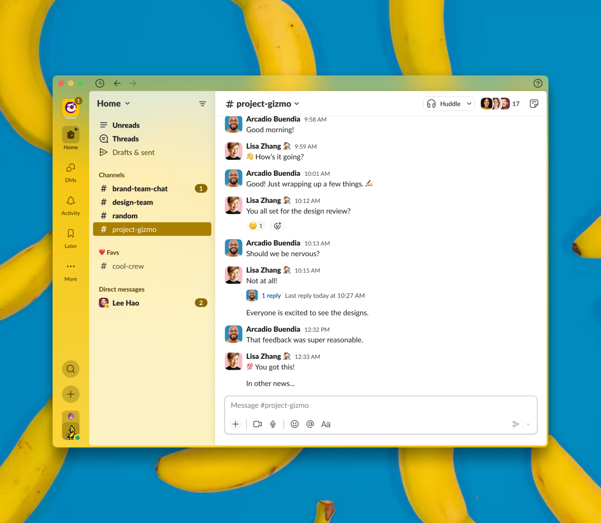
All of this should help you keep tabs on what’s going on. The upshot is that the Slack UI may become more cluttered, and — if you’re like me, who stashes Slack on a monitor in a narrow portrait orientation — much wider. Slack’s new UI feels more like File Explorer, with a hierarchy of threads, groups, workgroups and more. It appears you’ll see more columns of information than you do now.
You can make the argument that these additional columns of information will help alleviate the nagging anxiety that you’ve missed something important, after disappearing on vacation or a business trip for a few days. An update to the Search experience, Slack says, will now show the context of a search result, instead of making you investigate whether that snippet of information hides the answer you need.

Slack
That, in some ways, might help me deal with the ongoing fragmentation of information: Did I see a crucial piece of information on the web? In email? In a shared document? In a direct message? Just keeping tabs on it all is something that more and more channels complicates –and that’s before you add in Slack’s recent shared workspaces, Canvases. And all of this, really, is Slack’s fault, a consequence of replacing a summary email with the give-and-take of a conversation. (To be fair, it’s not like rivals like Google Workspace or Teams aren’t headed in this direction, either.)
So yes, it does feel like Slack is taking steps to manage the flow of information, but I can’t help feeling that it won’t be able to hold back the tide.

Slack


