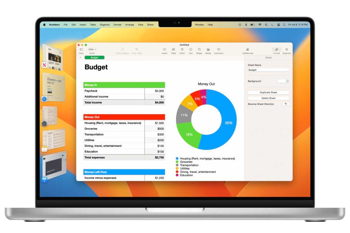
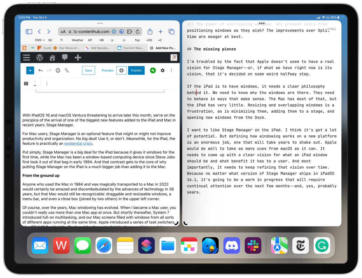
With iPadOS 16 and macOS Ventura threatening to arrive later this month, we’re on the precipice of the arrival of one of the biggest new features added to the iPad and Mac in recent years: Stage Manager.
For Mac users, Stage Manager is an optional feature that might or might not improve productivity and organization. No big deal! Use it, or don’t. Meanwhile, for the iPad, the feature is practically an existential crisis.
Put simply, Stage Manager is a big deal for the iPad because it gives it windows for the first time, while the Mac has been a window-based computing device since Steve Jobs first took it out of that bag in early 1984. And that contrast gets to the core of why putting Stage Manager on the iPad is a much bigger job than adding it to the Mac.
From the ground up
Anyone who used the Mac in 1984 and was magically transported to a Mac in 2022 would certainly be amazed and discombobulated by the advances of technology in 38 years, but that Mac would still be recognizable: draggable and resizeable windows, a menu bar, and even a close box (joined by two others) in the upper left corner.

Foundry
Of course, over the years, Mac windowing has evolved. When I became a Mac user, you couldn’t really use more than one Mac app at once. But shortly thereafter, System 7 introduced full-on multitasking, and our Mac screens filled with windows from all sorts of different apps running at the same time. Apple introduced a series of task switchers, Mac OS X 10.0 added the Dock and the three stoplight buttons, and later updates added the ability to manage windows with Exposé, Spaces, and Mission Control.
In other words, Apple took a concept–the original Mac interface–and then iterated on it for 38 years. It’s not perfect–most notably, the company has spent a couple of decades trying to figure out ways for regular users to find windows that have been lost behind other windows–but it’s got a real infrastructure behind it. It’s a metaphor that has been extended and elaborated upon with iconography, menu bar commands, keyboard shortcuts, trackpad gestures–the works.
The iPad’s been around for more than a decade, but its history with windowing is essentially nonexistent. iPadOS 15 introduced Quick Note and the “floating center window” in apps like Mail–they were windows, sort of, but one-off windows that followed their own rules. Still, it was a tentative start. But beyond that, there’s really nothing to define what a window on an iPad could be, how it should behave, and how a user would manage a bunch of them.
So macOS Ventura will bring Stage Manager to the Mac, where it will be shuffling and managing familiar windows in new ways. That’s not nothing, but it can take advantage of 38 years of infrastructure and interface grammar.
On the iPad, though, Stage Manager must literally create an entirely new windowing metaphor, out of whole cloth, on day one. It’s an enormous job. Is it any wonder that all summer, Apple has apparently struggled with it?
An iPad identity crisis
Let’s work backward for a moment: What problem on the iPad is Stage Manager supposed to solve? It’s supposedly the inability for users to rapidly work with multiple windows and multiple apps, as they do on the Mac. The larger your display–and my iPad Pro’s display is only slighter than my MacBook Air’s–the more space you have for more windows, and the more ridiculous the iPad’s one- or two-apps-at-a-time interface becomes.
The problem with the current approach to iPad multitasking, Split View, is that it begins to break down when you want to use more than two “windows” (they’re really tiles) at once. While tiled interfaces are incredibly space efficient–there’s no need for window chrome!–they’re also pretty inflexible. I try to imagine creating a four-paned view on my iPad Pro, and I picture a frustrating puzzle. I know that tiling has its adherents, but I am not one of them.
Windows, on the other hand, are time-tested and have a lot of benefits. Though they do require a lot of window chrome that takes up space, they have the advantage of overlapping with one another. Longtime Mac users might not even notice that they’re doing it, but the beauty of overlapping windows is that you can have multiple documents at the ready while one particular document is front and center. It’s an efficient use of space because it doesn’t require the contents of every open window to be on screen at once.

Jason Snell
The problem with iPadOS 16’s Stage Manager is that it can’t decide what it wants to be. It offers windows, so you’d think that it would have decided to lean toward the Mac style of doing things. But one of the best features of windows is that they can be arbitrarily resized and moved around–a feature that Stage Manager resists. iPad windows can only be opened to certain sizes and shapes, and most frustratingly, they can only be dragged into certain locations.
When I try to use Stage Manager on my iPad Pro, I almost end up with a single configuration: two windows, more or less equally sized, next to each other. I end up so frustrated with Stage Manager that I essentially re-create Split View! (In fact, if you position two windows in this way and turn off Stage Manager, it literally transforms into a Split View.)
I can’t speak to why Apple chose this hybrid approach, but I can’t say that it makes sense to me. If the goal is to provide all the power of overlapping windows, why prevent users from positioning windows as they wish? Thus the improvements over Split View are meager at best.
The missing pieces
I’m troubled by the fact that Apple doesn’t seem to have a real vision for Stage Manager–or, if what we have right now is its vision, that it’s decided on some weird halfway step.
If the iPad is to have windows, it needs a clear philosophy behind it. We need to know why the windows are there. They need to behave in ways that make sense. The Mac has most of that, but the iPad has very little. Resizing and overlapping windows is a frustration, as is minimizing them, adding them to a stage, and opening new windows from the Dock.
I want to like Stage Manager on the iPad. I think it’s got a lot of potential. But defining how windowing works on a new platform is an enormous job, one that will take years to shake out. Apple would do well to take as many cues from macOS as it can. It needs to come up with a clear vision for what an iPad window should be and what benefit it has to a user. And most importantly, it needs to keep refining that vision over time. Because no matter what version of Stage Manager ships in iPadOS 16.1, it’s going to be a work in progress that will require continual attention over the next few months–and, yes, probably years.


