Struggling to digest large chunks of online text? Discover how Microsoft Edge’s immersive reader mode can transform your reading experience, making content more manageable and enjoyable.
As someone with ADHD, long articles and large blocks of text have always been daunting to me. Then I found the built-in Immersive Reader mode for the Edge browser contains several features that have helped me tackle some of the longest articles you can find on the internet. I’ve discovered this mode to be incredibly valuable, and I’m eager to share where it can be found within Edge, how to utilize it effectively, and its benefits for all readers, especially those who are neurodivergent.
Where to Find Immersive Reader
The option to use Immersive Reader will appear whenever you are on a webpage with text that can be converted into its modified format. When it is available you will see an open book icon within your address bar on the far-right. You can either click the icon when it appears or press F9.
Read Aloud
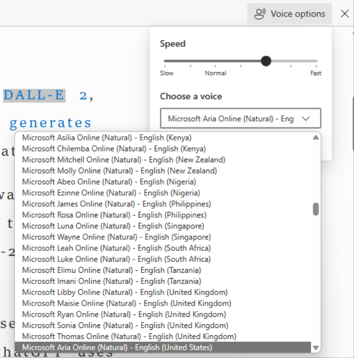
This option is also available outside immersive reader, and it’s what first got me into finding reading tools. To adjust this feature’s settings, select “Read Aloud” then select “Voice Options.”
Like other accessibility features that help users with visual impairements, Edge’s Read Aloud function comes with several voice options in numerous languages.
You can adjust the voice speed in Edge’s Read Aloud feature, but unlike other apps that use number multipliers (1.25x, 1.5x, 2x, etc.), Edge offers a simpler “Slow”, “Normal”, and “Fast” range with a few additional options in between. More precise control would be nice, but overall it gets the job done.
While you may be able to read text onscreen without any issues, the Read Aloud function offers several benefits. Personally, it helps guide my reading by audibly reading and highlighting the text. I even use this feature with sound muted, solely for the guided, highlighted text. Increasing the digital voice speed helps me stay engaged by reducing mind wandering. It requires focus yet less mental strain to avoid missing important information. Alternatively, if you don’t need to focus on an article, you can have it play in the background like a podcast while you do something else.
Line Focus
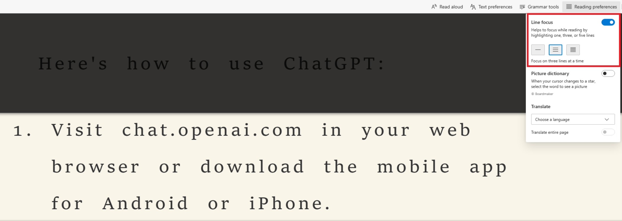
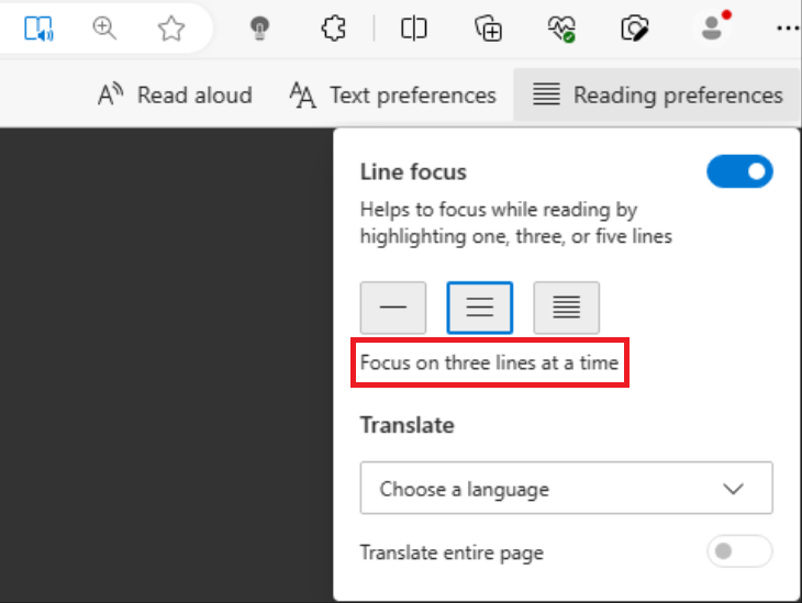
Line Focus highlights a chosen number of lines: 1, 3, or 5. You can scroll through the text one focus block at a time or use the arrow keys to navigate to the next or previous focus block. To use this feature, select “Reading Preferences” then toggle “Line Focus.”
Line focus in action, with 3 line setting enabled
Finally, select the preferred number of lines you want to focus on at a time.
Line Focus is the primary reason I still used Immersive Reader, instead of just using the Read Aloud feature that is also native to Edge outside Immersive Reader. I’ve always struggled with skipping lines or losing my place in long texts. This tool is akin to sliding an object down the page of a physical book, such as a piece of paper or a ruler. It also reduces anxiety about dense text. Lengthy articles and Reddit posts seem less daunting when viewed in smaller sections. This approach improves readability and makes the content more approachable.
Text Preference Options
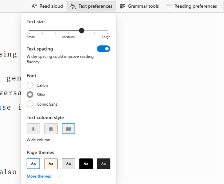
In the text preferences tab, you can make the text bold, choose different fonts and sizes (ranging from small to large), adjust spacing and column width, and select page themes to reduce eye strain. Simple select “Text Preferences”, between “Read Aloud” and “Grammar Tools” to find the settings, detailed below
These three Text Preferences options control text layout and let you decide how much you’ll see on your screen at once.
Text size ranges from small to medium to large. Adjusting the text size is crucial for visually impaired readers. Although, even if you aren’t visually impaired limiting the amount of text on screen at one time can help reduce feeling overwhelmed with information. Examples of “Small”, “Medium”, and “Large”.
Text size set to small
Text size set to medium
Text size set to large
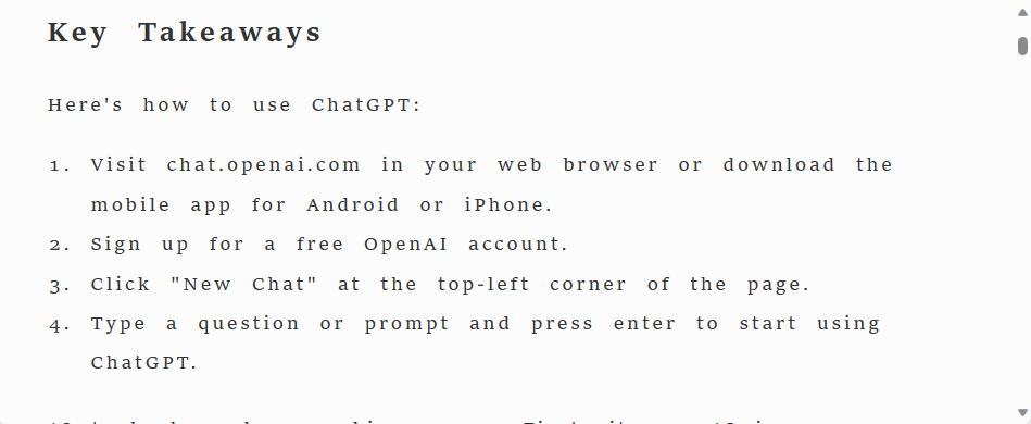
Text Spacing, a toggleable feature, doubles the line spacing for better readability. It prevents large blocks of text from appearing dense and overwhelming, making it easier to read and understand, especially when focus is a challenge.
Text with no spacing
Text with spacing
Text column style has three options to adjust the amount of blank space on either side of the text, bringing it closer together or spreading it out. This helps you control the amount of text displayed on your screen, though in combination with other features, it can be extreme. I find the widest setting works well when combined with Line focus.
Column width set to narrow
Column size set to medium
Column size set to wide
Then there’s Font and Page Themes. Font, text color, and page background color play a crucial role in reducing mental and visual strain on your eyes and brain. Studies indicate that individuals have preferences for specific combinations when it comes to reading. Finding the right combination that aligns with your preferences can help you read for longer periods without feeling mentally exhausted.
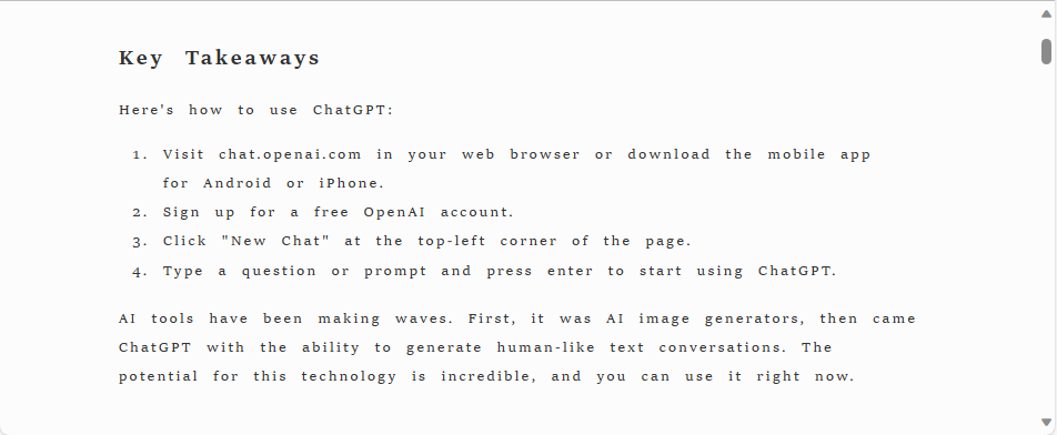
Certain individuals, particularly those with dyslexia, appear to have improved reading comprehension when the font uses serifs, the small lines that punctuate certain letters. Within Immersive Reader, this preference can be used with the font, “Sitka”.
Sitka (with serif)
Others appear to read more efficiently with text that excludes serifs (sans serif). In Immersive Reader this option is available with the “Calibri” font.
Calibri (sans serif)
And finally, there is “Comic Sans” if you just like to be silly.
Page themes adjust text and background color, helping readers find their preferred combination. There are numerous options, and some may seem pretty out there, such as black text on a bright green background.
Common preferences, besides black on white, include black on beige (or sepia) or black on gray. Those who use these options often say they resemble the look of physical paperback novels.
Black text with sepia background
Alternatively, some prefer white text on a black background, also available in Immersive Reader with gray text on a black background. Many find these options reduce eye strain during prolonged reading sessions.
White text on black background
There is no universally applicable solution, and discovering your preference will require personal experimentation with these text combinations. So, feel free to explore and determine which one resonates with you the most.
Being diagnosed with ADHD and accepting the need for additional tools to make reading easier has reopened my love for reading. Previously, I may have felt shame for needing extra help to do something I used to do effortlessly. Overcoming that shame has brought back the joy of reading for long hours.
It’s essential to be aware of the options available for accessibility and experiment with different features until you find what works best for you. Doing so can reintroduce a passion for reading that may have faded as we got older. Check out our guides for other popular in-browser reading assistants: Safari’s Reader Mode, Firefox’s integrated reading add-ons Pocket, and Google’s Reading mode for Android. As a bonus, you can use the tools of Immersive Reader not only in Microsoft Edge, but also in Word, Outlook, and OneNote.
Don’t let struggling with large blocks of text keep you from tackling that monstrously long online article. Try out Edge’s Immersive Reader Mode, or explore similar tools available to you, and start reading again with ease.


