This Saturday marks Apple’s 47th birthday as a company, and it’s fair to say the company has dreamed up some incredible designs over the years. Sure, it’s had a few design howlers too, but when it comes to consistency, the designers at Apple have more wins under their belt than anyone.
Looking back at the past 47 years, these are the physical pieces of tech design that captivated us most from some of its most beloved products and show just how deep Apple’s design pedigree goes.
The iMac G3’s translucent case

Apple’s great Mac designs are not just limited to its laptops. The iMac G3 — the desktop Mac that saved Apple — was a trailblazer in the world of computer design.
At the time of its launch in 1998, computers were still daunting devices to the general public and mostly remained the preserve of the world’s tech nerds. Apple wanted to change that, and the iMac G3 was tasked with leading the charge. It was able to achieve this feat thanks in large part to its translucent plastic shell.
The semitransparent outer casing was so important because it allowed users to see inside the computer. No longer were its internals hidden and totally inscrutable. Now, you could peer inside and see how everything worked. And instead of something scary or infinitely unknowable, all that was revealed was a bunch of chips mounted on a circuit board.
In other words, the casing helped to completely demystify the personal computer. The iMac G3 was approachable in many other ways — its bright colors and handle encouraged you to reach out and touch it, for instance — but without the translucent shell, it wouldn’t have been nearly as effective.
iPod click wheel (2001)

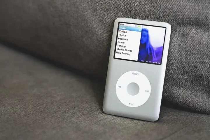
Few digital devices have had the impact of the iPod, which made portable listening simple, ushered in the podcast era, and changed the entire music industry. None of that would have been possible if the device wasn’t fun and easy to use, yet it was exactly that thanks to its genius click wheel.
Instead of mounting an overwhelming plethora of buttons to the front of the iPod, Apple kept things straightforward with a simple circular design. There were five buttons for playing, pausing, skipping tracks, accessing the menu, and selecting a menu item. To move up or down a list, you just rotated your thumb in a clockwise or counterclockwise direction. Nothing more and nothing less than you needed.
It was the perfect encapsulation of Apple’s design philosophy, which focused on stripping away anything unnecessary that got in the way of using a device. It was an elegant marvel that could be operated by anyone, the first time of asking. And interestingly enough, it wasn’t a creation of Steve Jobs or Jony Ive but was instead dreamed up by Apple’s marketing chief Phil Schiller.
The iMac G4’s all-in-one base (2002)

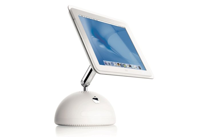
In the early 21st century, Apple’s Macs were on a roll. After the barnstorming triumph that was the iMac G3, Apple followed it up with the iMac G4, a computer that was undoubtedly one of the best Macs ever. This time, much of its success rested on its all-in-one base.
In the early 2000s, most computers still used clunky towers and CRT monitors. The iMac G4, however, managed to stuff all of its internals into a tiny base that supported a flatscreen monitor. It was such a feat of engineering at the time that it elicited responses of “where’s the computer?” from stunned onlookers.
But hiding everything in the base wasn’t just a neat party trick — it helped enable its super-thin LCD display. By shrinking everything down and housing the internal components inside a convincingly small base, the monitor was freed up to be as thin as Apple could make it. It was an inspired rethinking of the traditional desktop computer.
MagSafe connector (2006)

Long before the mobile charging tech bearing its name, the original MagSafe was a lifesaving invention that was an indispensable companion to any MacBook. After Apple abandoned it for a few years, it made a triumphal return to the latest MacBook models.
How does it work? It’s simple. The MacBook’s charging cable is equipped with a magnetic adapter that snaps onto the laptop’s charging port. When the cable is tugged — such as when someone walks past your desk and trips on the lead — the magnetic connection splits and the cable breaks loose, preventing your computer from being dragged into a violent collision with the floor.
It’s such an effective idea yet so simple at the same time, making it the epitome of Apple’s design thinking. Modern MacBooks just aren’t complete without it.
iPhone Home button (2007)

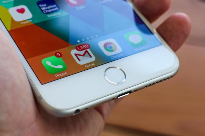
The original iPhone is arguably the greatest design Apple has ever dreamed up, an instantly recognizable device that dragged the mobile industry kicking and screaming into the modern era. One reason it did so well was thanks to its simple Home button.
Before the iPhone, smartphones were outfitted with so many buttons that you’d think they were going out of style. That was fine when you needed to type, but when you didn’t, you lost half the phone to an unnecessary keyboard.
Apple threw all that out the window with a design that used just a single button. The beauty of this idea was that the rest of the phone was dedicated to a malleable multitouch display. For most things, you’d use gestures. The only time you couldn’t was when you needed to get back to the Home Screen, which was where the Home button came in.
By itself, the Home button seems rather humble, perhaps even unimportant. But without this modest button, the all-screen design of the iPhone wouldn’t have been possible. And without that, the smartphone industry would be incredibly different today — and probably much worse off.
The MacBook Air wedge (2008)

Steve Jobs was known to be a showman, so much so that his presentations became known as “Stevenotes” instead of keynotes. But in a career littered with memorable product reveals, the original MacBook Air launch stands out above the rest — and it was all down to its incredible design.
The laptop was so thin that Jobs was able to hide it inside a manilla envelope, revealing it to audible gasps from the crowd. In fact, as Jobs made clear during the presentation, the thickest part of the MacBook Air was slimmer than the skinniest part of the industry’s leading slimline laptop. It tapered down to an unbelievable 0.16 inches, blowing every rival device out of the water. In an instant, the market for thin and light laptops was changed forever.
That wedge shape was such an iconic design that it lasted close to 15 years, from 2008 until 2022’s redesigned MacBook Air. In an industry that moves at light speed, that attests to its lasting prowess as an exceptional piece of design.
Force Touch trackpad (2015)

There’s nothing quite like the feeling you get using a Force Touch trackpad for the first time and then realizing it has no moving parts and instead mimics a traditional trackpad by gently tapping your finger as you press it. Apple’s Mac trackpads are so well-engineered that it’s only when you turn off the computer that you realize it’s all a clever illusion.
But Force Touch isn’t just Apple flexing its engineering muscles and making a solid-state trackpad just because it can. By reducing the number of moving parts, Apple lessens the chances that something will fail or break down. That helps its MacBooks and iMac trackpads last longer.
It’s a great example of a famous Steve Jobs quote put into action: “Most people make the mistake of thinking design is what it looks like … It’s not just what it looks like and feels like. Design is how it works.” The Force Touch trackpad doesn’t just look and feel good, but it works incredibly well too. That makes it a superb design.
Digital Crown (2015)

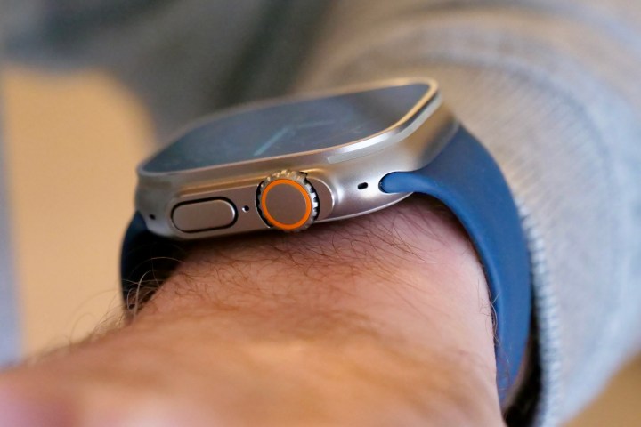
The Apple Watch is a global success. One of the reasons why is probably how familiar it feels to traditional watch wearers. Part of that familiarity is the Digital Crown, which mimics the winding crown you’ll find on analog counterparts. Yet the beauty of the Digital Crown lies in how much functionality it is capable of.
You can press it once to see the Home Screen or press it twice to return to the last app you opened. Pressing and holding it activates Siri while rotating it lets you zoom, scroll or alter what’s on the display, depending on the app you’re using. All that is contained in a small, unobtrusive dial that immediately conveys how you’re expected to use it.
This combination of new features and classic design makes the Digital Crown a key innovation from Apple, one that has spread to the AirPods Max and might even find its way into the company’s upcoming mixed-reality headset.
Editors’ Recommendations


