I could use a Mac upgrade, but I’m a cheapskate and I’ve put it off. The performance of my old Mac is fine for what I do. A lot of great deals have popped up recently for the 14-inch MacBook Pro, but I haven’t made the investment.
But you know what would finally make me spend my money? A Mac with Dynamic Island.
Dynamic Island is a new user interface element that was introduced with the iPhone 14 Pro. With this phone, Apple redesigned the front notch to a pill shape, but instead of something on the screen that you try to ignore (as you did with the notch), Apple decided to give it a name and make it a key way to interface with the phone.
Apple’s Dynamic Island demos during the iPhone 14 event were dazzling. Cute little icons pop up, and tapping them brought up relevant and useful controls. It seemed like Apple performed magic by turning what is commonly perceived as a hindrance and made it a useful interface anchor point.

How cool is it to see an icon of the AirPods show up in Dynamic Island when they make a connection? So cool that it needs to be on the Mac.
Foundry
I recently got my hands on an iPhone 14 Pro Max and Dynamic Island feels like it’s on the brink of being something special. There are a lot of functions it works with and it works with third-party apps that use Apple’s APIs like the Now Playing API that handles media playback. It’ll be fun to see third-party developers come up with creative ways to implement it, and then the full power of Dynamic Island will be realized.
That power and excitement needs to translate to the Mac. Apple’s 14-inch and 16-inch MacBook Pro already have notches and the display could easily be reconfigured to mimic the pill-shaped Dynamic Island. On the iPhone, Dynamic Island brings a fun, whimsical feel to the UI and it would work just as well on a Mac. For example, I’d love to see the icon of the podcast I’m listening to minimize into a Mac Dynamic Island, just as it does on an iPhone, and if I click it, play controls appear.
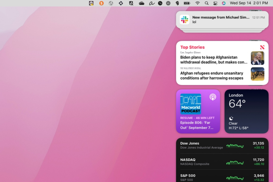
Now, it can be argued that the Mac doesn’t need Dynamic Island, because it already has the menu bar. It’s true that the menu bar does a lot of the same functions, but the right side of the Mac UI is getting pretty cluttered. Menu bar icons align right, and anything that appears on the Desktop (storage devices, network servers, saved files) appears on the right side of the screen. Notifications also pop up on the right, and if you click on the time in the menu bar, a column of notifications and widgets appears over any Desktop icons. A Mac Dynamic Island would alleviate some of that right-side load.
Apple is already implementing features that were introduced with iOS into macOS, and often those features are tailored for Mac use, so they don’t always act the same between platforms. The same could apply to Dynamic Island–if it doesn’t make sense for a Dynamic Island function on the iPhone to act the same way on the Mac, then it doesn’t need to. For example, in the podcast example I mentioned earlier, the controls that pop-up don’t have to expand from the notch; since the MacBook Pro’s Dynamic Island would be surrounded by the menu bar, having it expand out into controls may not work because it could interfere with other items in the bar. Instead, those controls could appear in a pop-up just below Dynamic Island.

Dynamic Island can be used to clear up the cluttered macOS menu bar and the right side of the UI.
Foundry
And there are Mac-specific functions that could work in Dynamic Island, too. Multitasking on the Mac is much more robust than it is on the iPhone, so Dynamic Island could function a little differently. Maybe Activity Monitor could show CPU stats or memory use, or Zoom could show controls for mute and the camera. But. bringing a similar UI to the Mac would be a great way to liven macOS.
There are nuances to a Mac Dynamic Island that Apple would need to work out. Would it be a Pro only feature? Could the user have the option to deactivate Dynamic Island? How can you make sure that it doesn’t introduce UI that would be missing on a non-notched Mac? But I think it would be worth the effort. It’s a UI element I already appreciate on the iPhone and would love to have on a new Mac.


