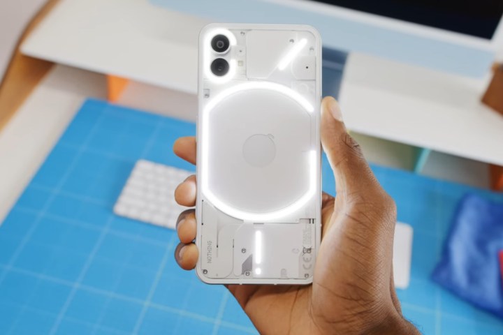
The Nothing Phone 1 is prepping for a July debut, but tech YouTuber Marques Brownlee (aka MKBHD) has already gotten his hands on the device and given us a glimpse of its marquee trait — the signature LED light pattern at the back. Nothing is said to have fitted over 900 individual LED lights below the transparent glass panel.
As many had expected, Nothing is using that LED real estate for more than just blinking for notifications. In fact, there’s a healthy dose of customizability that you can tinker with, thanks to a dedicated dashboard for the whole setup.
Nothing calls it the Glyph Interface, and it offers a bit of functional touch rather than just serving as a standout design element. To start, users can adjust the brightness level of the LED array underneath the transparent rear panel. Aside from just lighting up for notifications, the LED strips can also be configured to flicker for Google Assistant responses.
Depending on the shape and placement of the LED lines, there is a proximally functional aspect to it. For example, the G-shaped strip surrounding the wireless charging coil illuminates when the phone is being juiced up wirelessly. Similarly, reverse wireless charging an accessory like wireless earbuds also triggers the LEDs.
The exclamation mark-shaped LED line at the bottom comes to life in all its luminescent glory when a USB-C cable is plugged in for charging. The most interesting part is that the small vertical strip acts as a charging progress indicator. It’s not lit for the entire duration of charging, though. The LEDs are off when the phone is sitting idle while being charged, but if you slightly shake it, the LEDs light up.
The entire LED array also collectively doubles as a light fill when the camera app is being used, and it appears to be sufficiently bright. It’s a neat convenience and should come in handy for capturing low-light photos and videos — especially at close range.

The customizability runs deeper than just visual cues. There are 10 ringtones, each accompanied by its own unique pattern for lighting up the LED strips in sync with the tunes. So, if one of those ringtones is set for emergency contacts or a family member, users will know who is calling them by the signature flashing pattern of the LEDs without having to flip the phone over. The LED lighting patterns also stand out on a per-app basis.
While the Nothing Phone 1 is not the first smartphone to embrace transparent aesthetics, the Carl Pei-led startup is definitely making the most of its LEDs and lending a functional aspect to it. But in doing so, Nothing also raises doubts about the whole package.
The case study
Are those LEDs the only standout feature, aside from the divisive Nothing OS launcher experience? The design already has some obvious iPhone 12 inspirations, but can it actually take on the Apple device when it comes to raw firepower and experiences, especially in departments like camera prowess? Ultimately, design can only go so far.

Apple also chased the compact phone nirvana with the ‘mini’ series, but practical failures like poor battery life have reportedly forced Apple to discontinue it after only two generations. Nothing appears to be focusing on the Phone 1’s standout design, but that could backfire majestically if the actual phone experience is underwhelming.
As my colleague Michael Allison puts it, “Nothing has made something for people that aren’t a fan of putting a case on their phone.” For those people, the Nothing Phone 1 looks incredible. But if you like using a case and don’t care about flashing LEDs, the argument for the Nothing Phone 1 is still difficult to see.
Editors’ Recommendations


