Alongside the new features, the first major update of Windows 11 (version 22H2) (opens in new tab) includes a long list of tweaks and improvements for the desktop experience.
In this release, you will find design changes for legacy elements, new visuals for hardware indicators, and other parts of the OS to match the design language of Windows 11 (opens in new tab).
Also, the Windows 11 2022 Update introduces a new way to snap applications with a new Snap layouts interface that drops from the top of the screen. The Taskbar gets “drag and drop” support to open files and pin apps. The Quick Settings and Notification Center received various improvements, and the Start menu introduces support for folders and settings to control the recommended items in the menu.
This guide will look closely at the desktop improvements that Microsoft is introducing with the Windows 11 2022 Update.
Windows 11 2022 Update desktop changes
Although the desktop may seem the same as before, version 22H2 adds several improvements.
Legacy elements with modern style
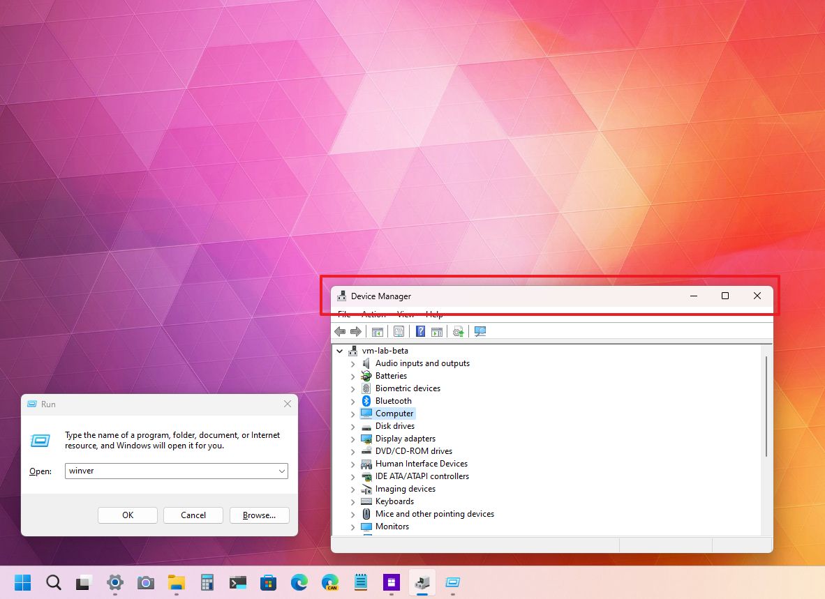
Windows 11 brings the mica material to legacy elements to make the experience more consistent.
After upgrading to version 22H2 (opens in new tab), you will notice that title bars (such as the one in the Run and Open dialogs and Control Panel pages) now also feature a semi-transparent style that shines through the colors of the desktop background like the rest of the experience, including File Explorer.
Hardware indicators update
After many years, the 2022 Update finally updates the system hardware indicators (such as volume, camera settings, and airplane mode) to match the new design style.
For example, after upgrading to this release, you will see a new volume indicator that appears center on the screen above the Taskbar, which is more consistent with the rest of the desktop.
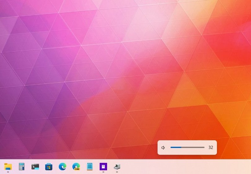
Although this is a subtle change, it’s important for consistency since the original version of Windows 11 still uses the interface the company designed for Windows 8.
Snap assist update
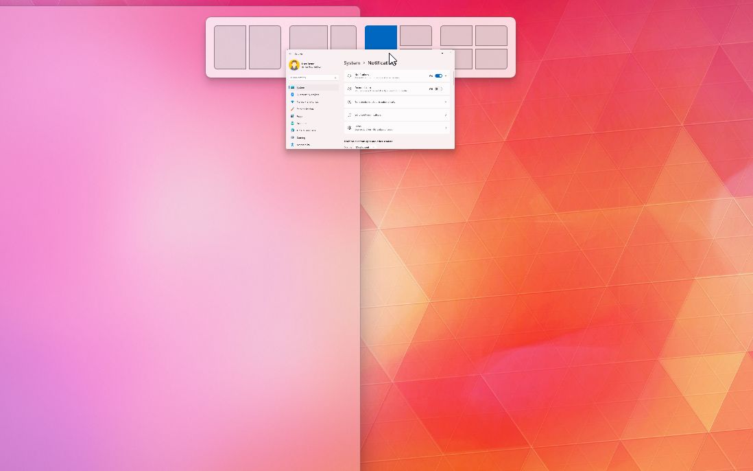
As part of the desktop changes, you will also find improvements for Snap assist. In this release, you can snap applications by dragging a window to the top edge of the screen to reveal the new Snap layouts dropdown menu, where you can drop the app and continue with the wizard to complete the layout.
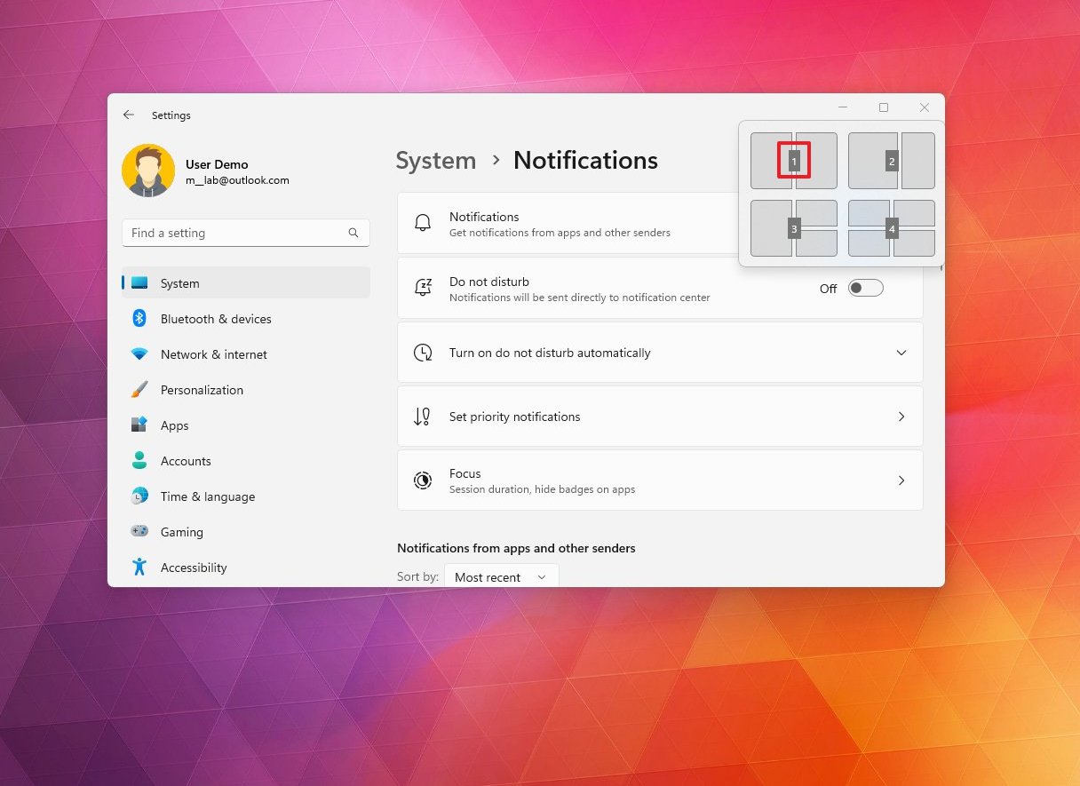
On applications, when invoking the Snap layouts from the maximize button using the “Windows key + Z” keyboard shortcut, the layouts menu will now appear with numbers to quickly select the layout using the number pad.
Also, Snap assist will now show the three most recent Microsoft Edge tabs as suggestions to snap in the layout.
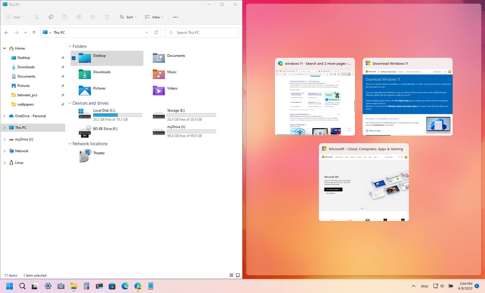
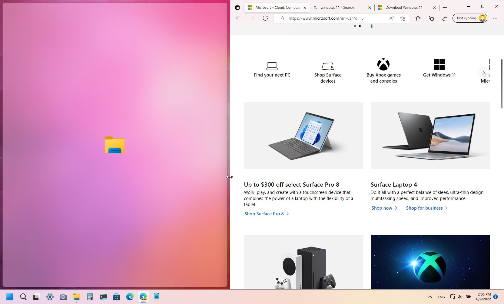
And when resizing the layout, the apps that are not in focus will show their icon in the center of the interface.
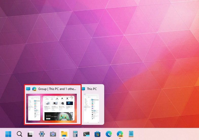
When hovering over an app that belongs to a Snap group, the preview will also show part of the desktop background to make it easier to understand the group. In addition, Snap groups will also appear in the Alt + Tab interface and Task View.
Furthermore, this release has updated the snapping animation to improve the overall experience from one snapped window state to another. You will also notice that the rotation is more responsive as you rotate a tablet or convertible between portrait and landscape.
You can have an even closer look at changes for Snap assist in this guide.
Taskbar improvements
On the desktop for version 22H2, you will find various improvements for the Taskbar.
In this feature update, you will once again be able to drag and drop files and apps. Similar to previous versions, you can now drag a file on top of a running app to bring it up in the foreground and drop the file to open it.
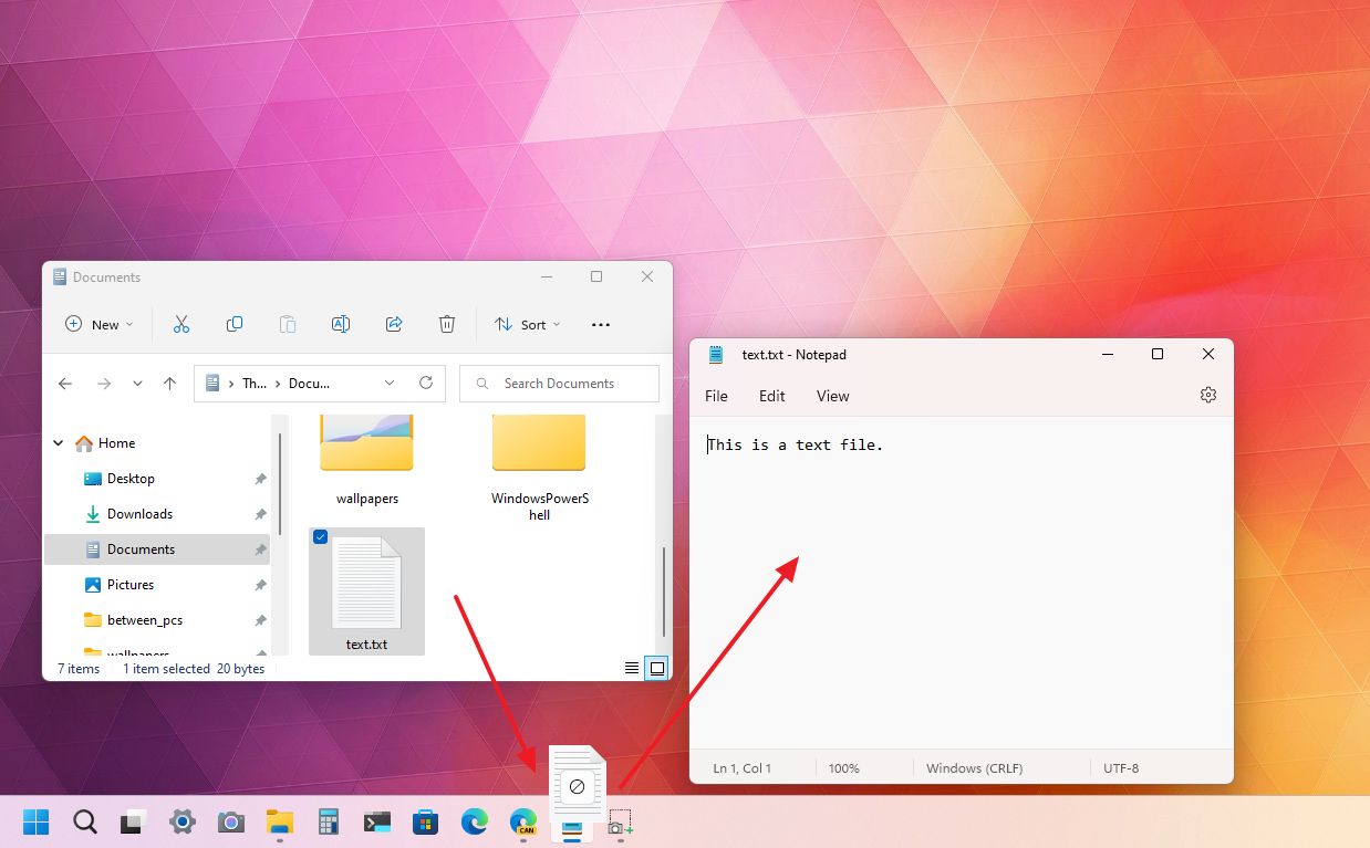
Also, it’s now possible to drag and drop apps from the “All apps” list to pin them to the Taskbar.
Using the “Windows key + K” keyboard shortcut to cast content to another device, the “Cast” icon will now appear in the System tray to indicate that the device is casting.
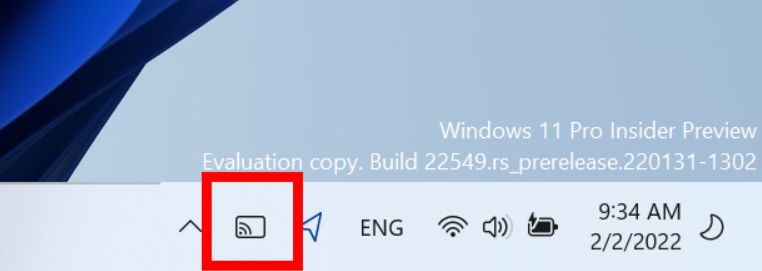
The battery charging icon has also been updated to include a lightning bolt icon instead of a power cable. In addition, the tooltip will now show the estimated battery life when hovering over the battery icon.
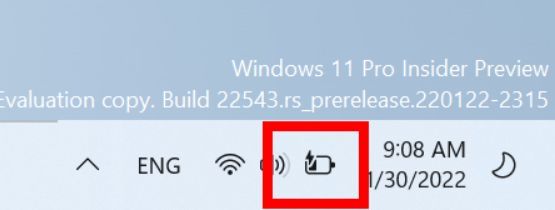
Also, the tooltip for the volume icon now shows when you use spatial sound, and when you scroll up and down with the mouse wheel over the icon, you can now change the volume level.
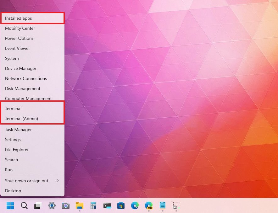
When you right-click the Start button, you will find a few tweaks. For instance, the “Apps & Features” entry has been renamed to “Installed Apps,” and the “Windows Terminal” entry is now called “Terminal.” Also, the Windows PowerShell entry will appear if the console is not present.
Quick Settings improvements
The Quick Settings and Notification Center flyouts also received some improvements.
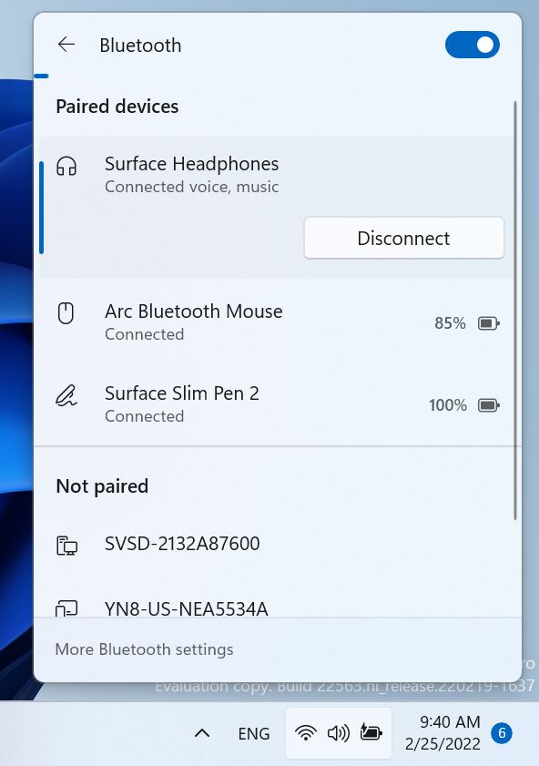
As part of the Quick Settings changes, if the computer has more than one color profile, you will now find an option to switch between profiles. The “Keyboard Layout” option is no longer available through this flyout, and the Bluetooth button now opens a new page where you can view your paired devices and the options to connect or disconnect.
Notifications Center improvements
In the original release of Windows 11, Microsoft introduced a redesigned interface for notifications with the mica material, rounded corners, and various improvements. However, it seems the company forgot to add some of these improvements to the toast notifications. In version 22H2, the background for toast notifications has been updated to include the semi-transparent style effect to match the rest of the design.
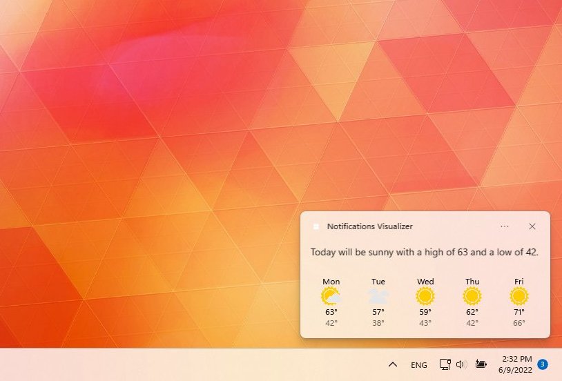
In addition, the animation for setting up Windows Hello notification has been updated.
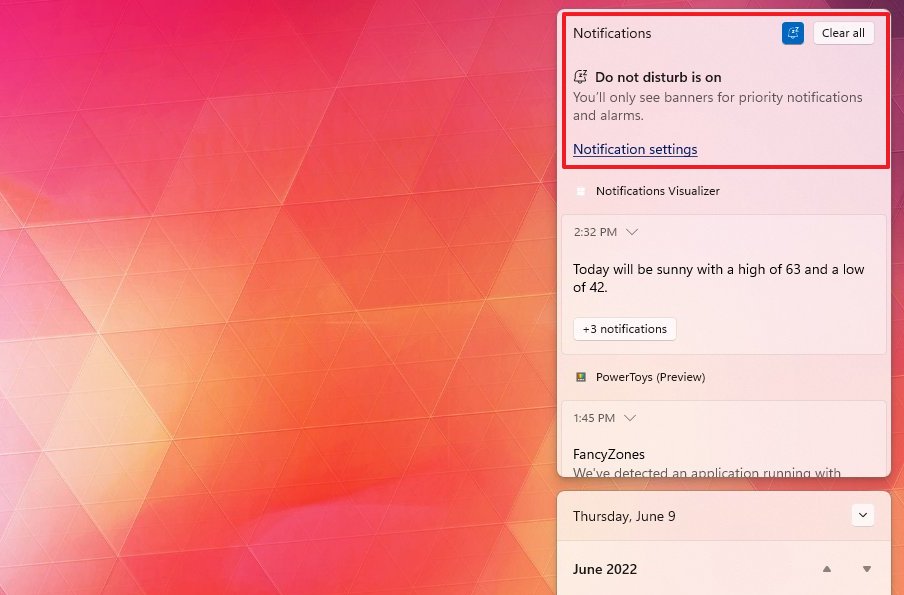
As part of the notification system, “Focus assist” becomes “Do not disturb,” and the feature has a new bell icon at the dashboard’s top-right corner.
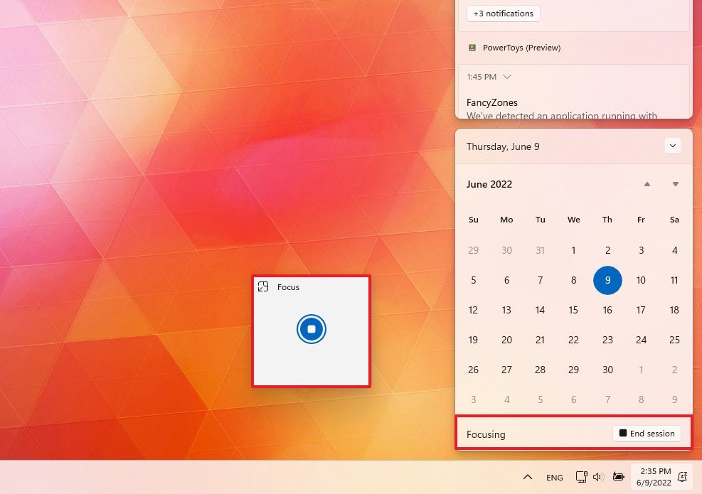
The Calendar section includes a new Focus option that lets you start a focus session with the Clock app to help you stay focused on a specific task.
When you start a new focus session, app badges and the flashing alert will be disabled, the focus timer will appear on the screen, and notifications will turn off.
Keyboard layout improvements
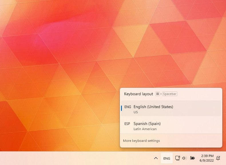
Also, the “Keyboard layout” flyout has been updated to include an acrylic background and improves the overall performance.
The Taskbar, Quick Settings, Notification Center, and Keyboard layout have even more improvements. You can learn more in this guide.
Task View and Alt + Tab interfaces
In this new version of Windows 11, the Task View acrylic background will expand to all screens on a multi-monitor setup.
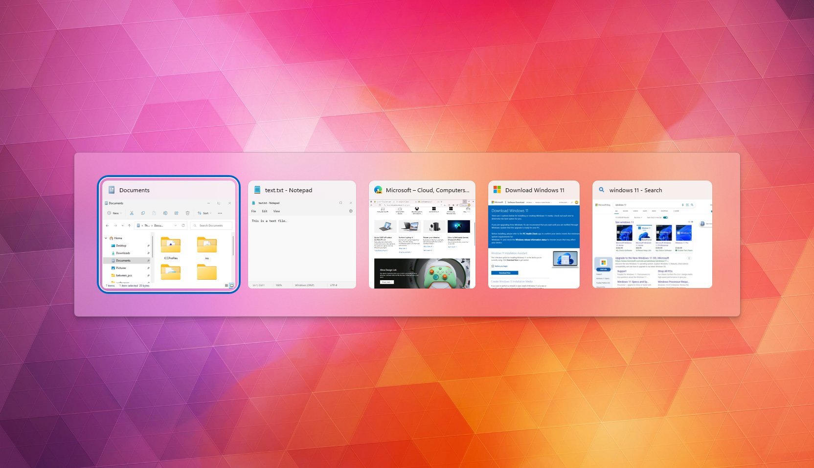
Also, the “Alt + Tab” interface now shows applications in a windowed frame rather than in full-screen.
Start menu changes
The Start menu can also be considered part of the desktop experience, and in this release, it’s getting a couple of visual and functional improvements, including folders and new layouts to organize the item recommendations.
You can now create folders to organize your pins, starting with the Windows 11 2022 Update. You can do this by dragging an app on top of another app to create a folder, and you can continue adding as many items as you need. You can also rearrange the icons and rename the folder.
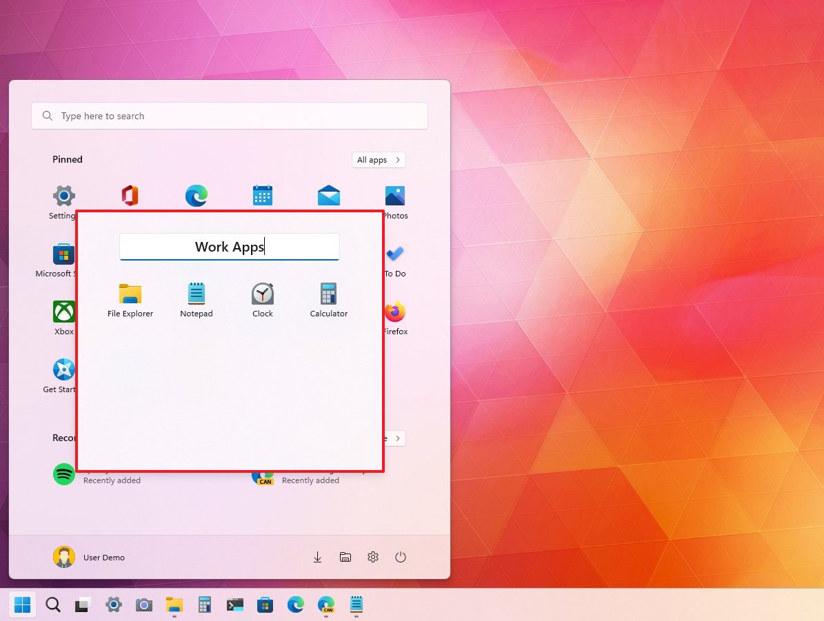
The recommendations section in the Start menu offers suggestions to pick up recently opened files and installed apps. As part of this feature update, you can now decide the number of recommendations in this area.
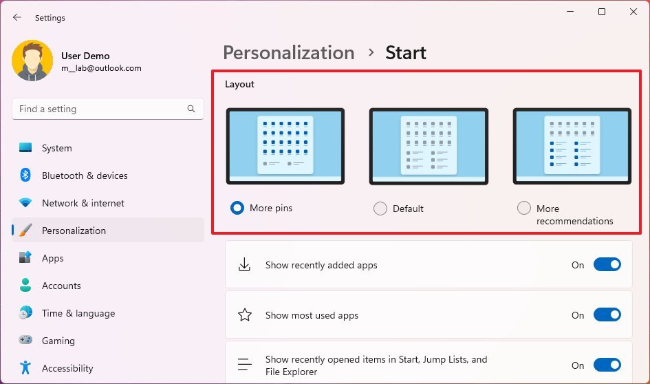
The new options are available through the Start settings page, under the “Layout” section. The “More pins” option shows a single row of recommendations. “Default” keeps the original layout with three rows of pins and three rows of recommendations. And “More recommendations” shows four rows of recommended items and two rows of pins.
The Start menu includes some other tweaks, which you can check out in this guide.
Context menu improvements
You will now find the modern context menu by right-clicking the Recycle Bin as part of the context improvements.
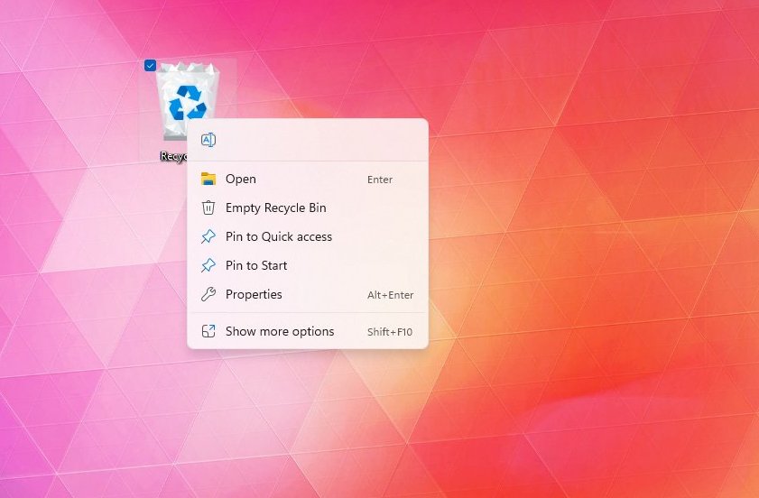
Across the experience, the legacy context menu now includes more padding around the items, and the selection now uses a light or dark color scheme depending on the system color.
Also, when right-clicking a file, you will now find new icons for Rename, Properties, Optimization options, and New folder to make them more consistent.
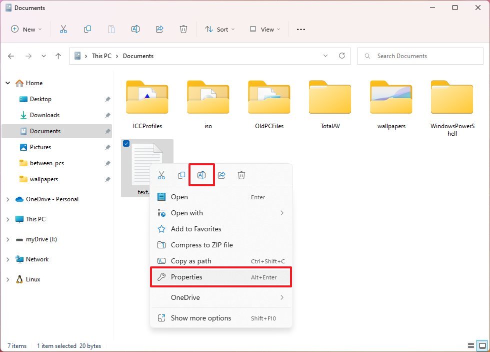
Furthermore, you can use the “Shift + Right-click” keyboard shortcut to open the classic context menu with fewer clicks.
More resources
For more helpful articles, coverage, and answers to common questions about Windows 10 and Windows 11, visit the following resources:


