WhatsApp Upgraded Its UI Piece By Piece, And Now The Work Is Done
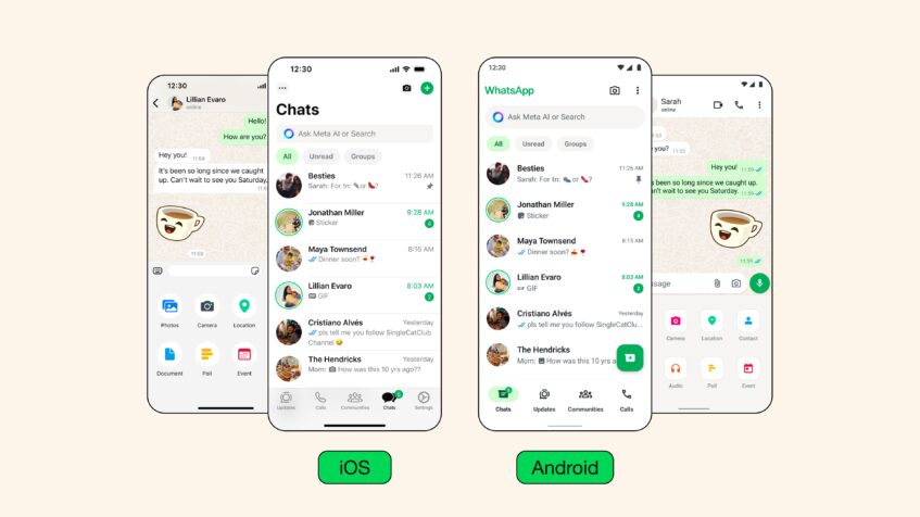
If you use WhatsApp, you might be thinking, aren’t we late to the party? The visual changes in WhatsApp have been around for a bit, sure, but the thing was, they weren’t official yet, which meant that while many users could see the changes, not all of them could. Now, things are finally official, and WhatsApp has a brand new coat of paint over it. Let’s talk about all the major changes that were made now.
New Color Palette
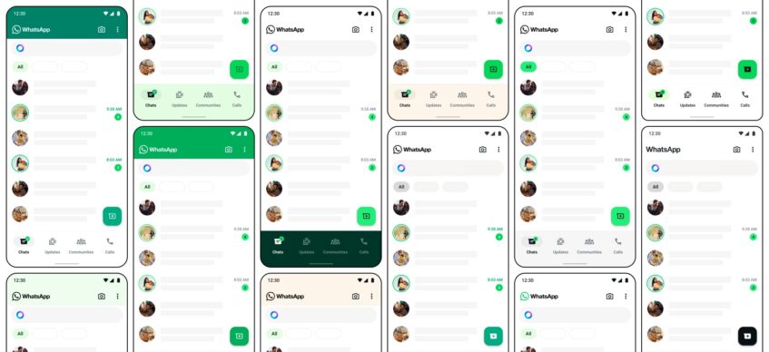
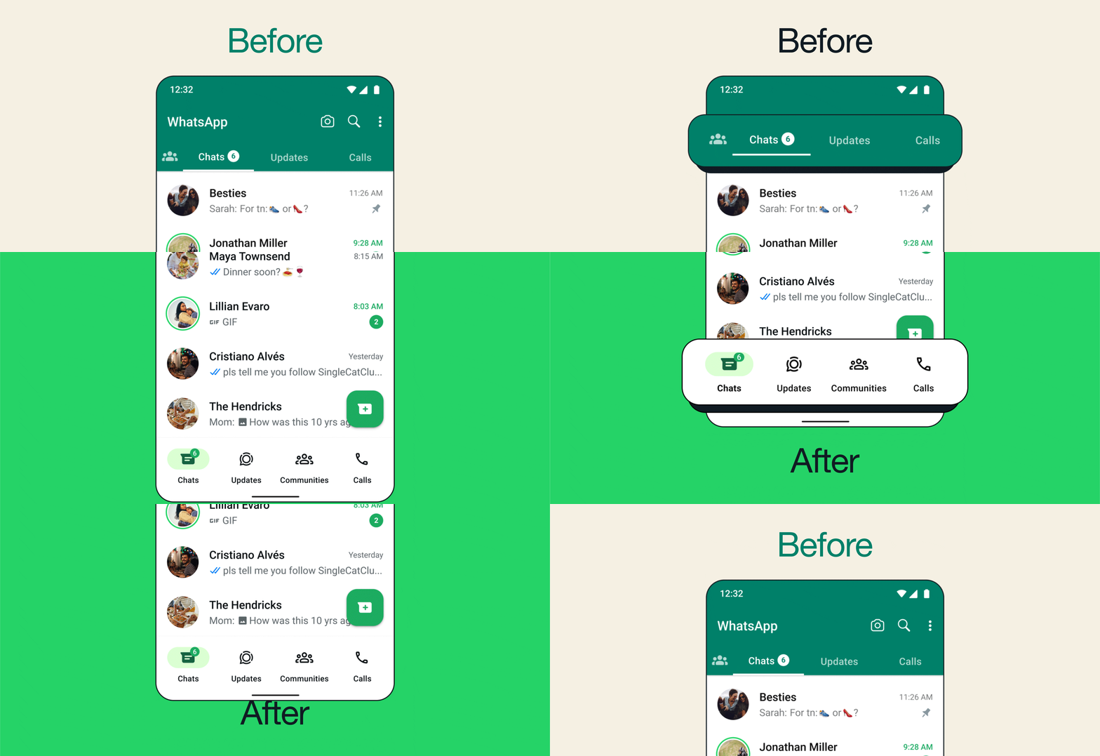
The first thing you’re likely to have noticed that would have let you in on the fact that WhatsApp has undergone a redesign is the new colors. WhatsApp has used a specific shade of green for quite some time now and I remember opening the app one day and just noticing that the new green seemed a few shades darker.
It wasn’t just me. People seemed to notice everywhere and some didn’t like it (though I think it was likely just because we were all used to the lighter hue). However, WhatsApp has said that the new color palette was the winner among 35 options and the deeper tones work better to reduce eye strain.
Bottom Navigation Bar
Another change that’s been made, which I’m a huge fan of, is moving the navigation bar from the top of the chat list to the bottom of the screen. This makes one-handed operation a lot easier, and along with this change in position, the navigation bar at the bottom is now colorless, which makes it blend into the rest of the chat menu a lot better than it did before.
Search Filters For Chat
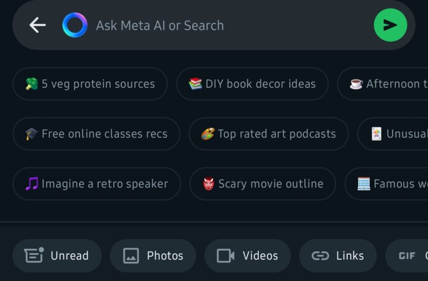

The search bar now doubles as a home for Meta AI, but it also improves the actual search experience by providing filters that you can use to narrow the searches you’re trying to make in your chats.
For instance, there’s an “Unread” filter that you can use to see only chats that you haven’t opened yet. There are also filters for different kinds of media like documents, audio, photos, videos, links, and even polls. So if you instantly want to see all the photos sent to you on WhatsApp in one convenient menu, this is how to do it.
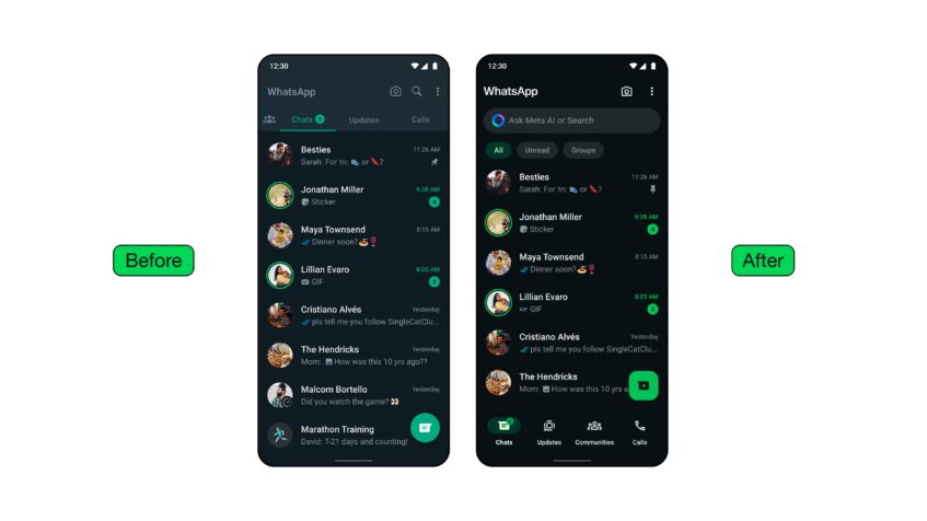
Darker Dark Mode
WhatsApp darkened its green to reduce eye strain and they save they also darkened dark mode for the same reason. I like my dark mode pitch-black, to get that AMOLED advantage, so while they aren’t quite there yet, darker is always better for me.
New Icons
You’ll also find that most of the suite of icons have been redesigned. You’ll likely notice this best when you select a message in a chat. The icons at the top of the screen to delete, forward, reply, etc. are now all toting a new look.


