One of the biggest imprints Steve Jobs and Jony Ive left on Apple’s design process is a certain kind of product idealism. At its best, Apple is striving to take ridiculously complex products, fusions of cutting-edge computer hardware design and eye-wateringly enormous software code bases, and make them simple.
It’s a philosophy that has led Apple to build wildly successful products that its customers love. And there’s one new iPhone 15 feature that perfectly illustrates why Apple’s idealism can take it to very interesting places.
Keep it simple
When Apple introduced Portrait Mode to the iPhone in 2016, the goal was to get smartphone photos to look as pretty as images captured on expensive cameras with long lenses–and that meant analyzing the photo and adding an artificial blur to the background.
That first iteration of Portrait Mode, in iOS 10.1, was rudimentary and chatty–it would tell you to back up, or find a subject with more light, or move closer, all because Portrait Mode really only worked in some very specific conditions.

Portrait Mode was introduced to the iPhone in 2016.
Foundry
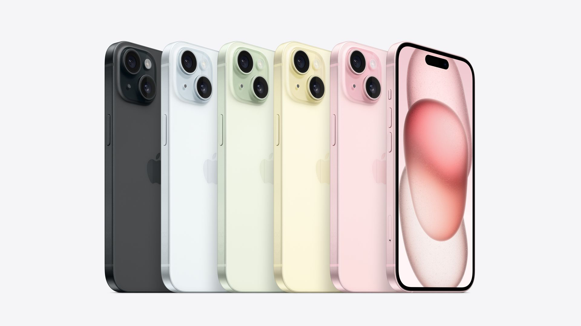
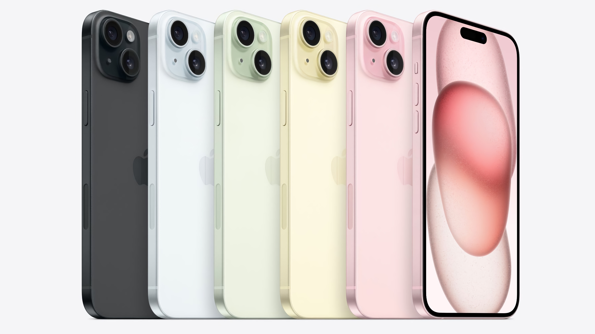
We’ve come a long way since then. Aided by machine-learning algorithms and additional phone sensors, today’s portrait mode shots look a lot better than ones from 2016. But with the launch of the iPhone 15, things have gone to a whole new level: Now, Portrait shots are taken automatically, even if you don’t have Portrait Mode turned on.
This is where Apple’s quest for simplicity drives it to make some very smart technical decisions. Why should the user have to choose to capture the data required to make a Portrait shot at all? Before, the constraints of Portrait Mode shooting meant that it needed to be walled off in a different section of the Camera app, but the iPhone’s sensors and software and hardware have gotten to the point where the phone itself can determine, on a shot by shot basis, if it’s worth capturing Portrait information–so the user doesn’t have to.
Imagining the perfect Camera app
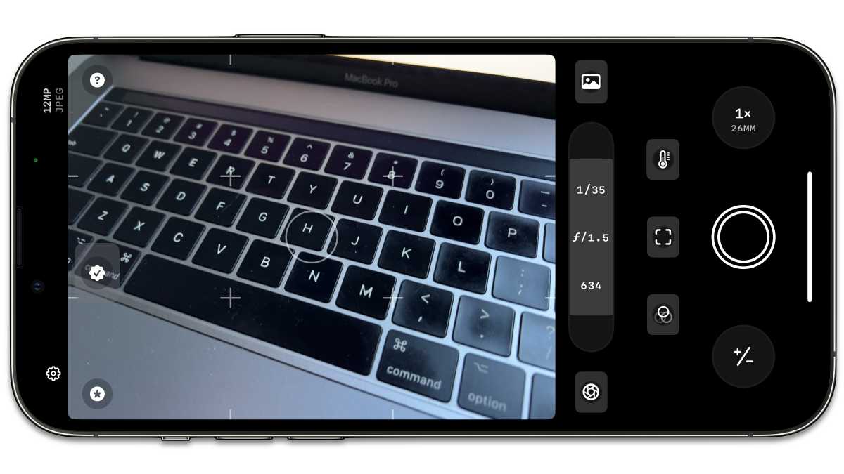
This feature got me thinking about Apple’s ultimate goals in designing the Camera app. Of course, Apple wants to provide users with control over the amazing cameras it builds into the iPhone these days–and so there are expert settings aplenty, some of them available by toggling various settings outside the app and others available by tapping icons in the app. People who really want to push things to the limit will use a third-party camera app like Halide or Obscura.
But most people who use the iPhone as a camera just don’t care about any of that. They want to capture a moment and have it look just right without any intervention beyond tapping the shutter button. That’s why I believe that, deep inside Apple Park, there’s an underlying belief that the Camera app should be as simple as possible–and that Apple should keep building hardware to make that possible.

Apple is aiming for simplicity with its Camera app. Photographers who need more manual control can turn to apps such as Obscura (pictured here).
Foundry
What’s the ideal Camera app, by Apple’s standards? Ultimately, I’d say one that has no modes at all except perhaps video and stills. Every single interface element you see in the app will need to fight to stay alive because if it can be eliminated, it should be. Already, Apple has tried to make various levels of zoom a continuum of high-quality data going through its image processing pipeline, so users don’t have to sweat it. Already, the shutter button is a proxy for a whole basket of image captures at various resolutions and light settings that are processed into the image you actually wanted to capture.
It can keep going. Why shouldn’t Action Mode activate automatically? Why can’t every shot include multiple full-resolution frames so you can pick the perfect one after the fact? (Many cameras already detect when someone in the shot is blinking and delay until the blink is over. That’s the tip of the iceberg.)
The ultimate goal is probably to let you hold up your iPhone and just capture a scene and let the software figure out the best video clips and still images and put them in a gallery for you. Wait, I take it back–the ultimate goal is that the capture is happening on something you wear, so your arms don’t get tired of holding the iPhone for the whole birthday party. That’s years away, but I’m sure Apple is already imagining it. The simpler, the better.
Action Button, agent of simplicity
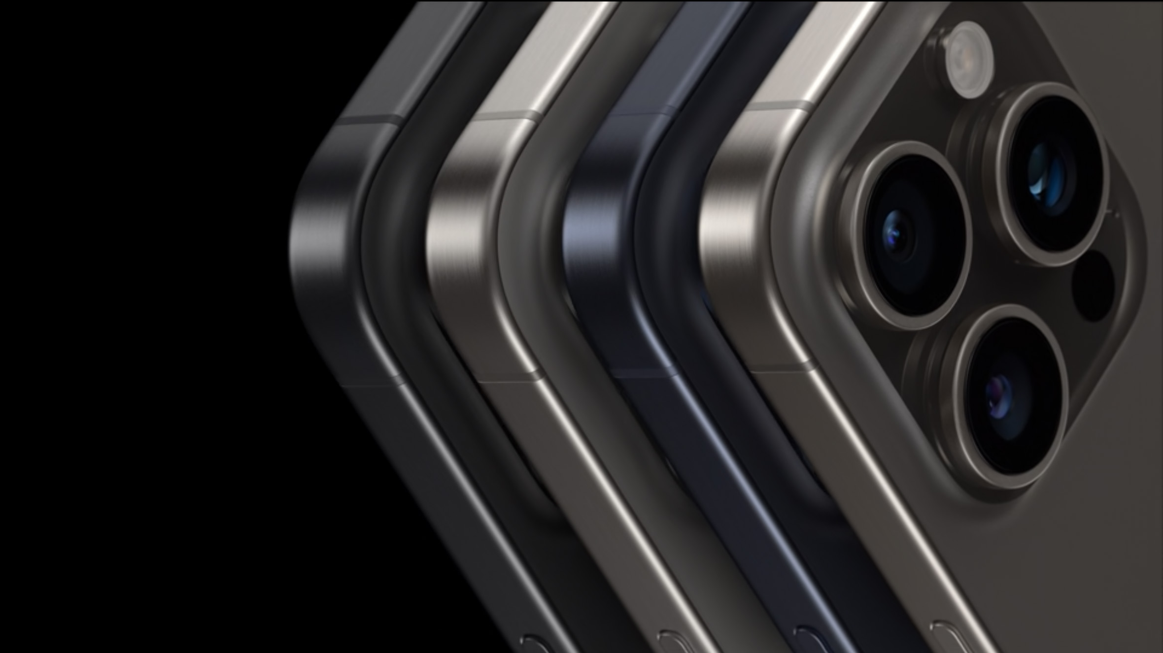
Hardware can supply simplicity, too. When Apple unveiled the Action Button on the iPhone 15 Pro, I saw several people point out that it was a waste to map the Action Button to the Camera app since there are already multiple ways to launch the Camera from the iPhone’s lock screen.
And that’s true, but those actions all require you to take the phone out of your pocket and swipe or tap in the right place, probably requiring you to glance down to make sure you’re making the right gesture. They are gestures that are simpler than unlocking your phone with Face ID and finding the Camera app icon, but things could be simpler yet.
Now, think of how you’d reach into your pocket to get a shot when the Action Button is mapped to the Camera. You reach in, grab the phone by the edges, bring it up to your face, and you’re already holding down on the Action Button. The Camera appears. You keep your finger right where it is and push down to take a picture. It’s hardware (your fingers) on hardware (the Action Button) in a routine that can become programmed into your muscle memory. It is, quite simply… simpler.
And that’s Apple’s whole point.
Apple iPhone 15 Pro (128GB)

Apple iPhone 15 (128GB)

Apple iPhone 15 Plus (128GB)


