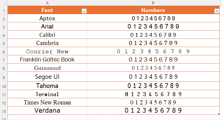
Choosing the right fonts to use in Excel can be the difference between a readable spreadsheet and a useless spreadsheet. After all, there’s no point in creating an all-singing-all-dancing spreadsheet if people can’t read the data!
In this article, I’ll talk through some of the things you should consider when selecting fonts in Excel, whether for labels on your charts or the contents of your spreadsheet’s cells.
People who
subscribe to Microsoft 365
have access to more fonts in Microsoft Excel than those who don’t. However, this article applies to anyone using all levels and versions of Excel.
Distinguishing Between Letters and Numbers
The main thing to think about is whether your data could be misread, and in no situation is this more likely than when letters can be confused for numbers, or vice versa. More specifically, look at whether there’s a clear distinction between the letter O and the number 0, as well as between an upper-case i, lower-case L, and the number 1.
Distinguishing between O and 0
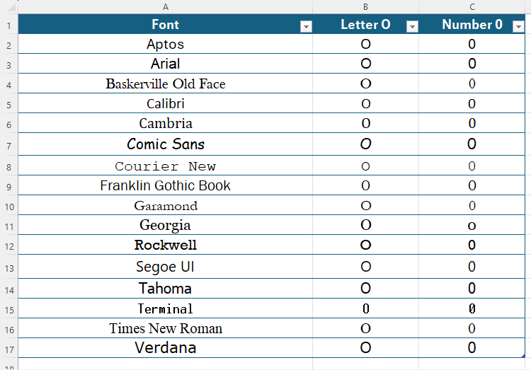
The primary distinguishing factor between O and 0 is usually the character width—the letter O is generally wider than the number 0. However, with some fonts, this isn’t as clear-cut.
Reviewing the commonly used fonts in the screenshot above, Franklin Gothic Brook’s letter O is only very marginally wider than its number 0, and Georgia’s number 0 looks like a lower-case letter O. These could cause issues in situations where numbers and letters are combined, such as in codes or serial numbers.
On the other hand, the most apparent distinctions between the letter and the number are in Aptos, Arial, Baskerville Old Face, Garamond, Rockwell, Segoe UI, and Times New Roman, primarily because their number 0s are so narrow. Terminal goes one step further and includes a strikethrough in the number 0, adding that extra difference between the two.
Distinguishing Between I, l, and 1
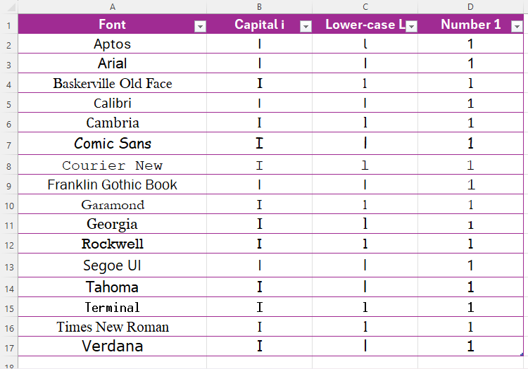
Deciphering between these three characters largely depends on whether they have serifs (short strokes attached to the ends of the number or letter stems) and, if they do, how pronounced they are.
This list raises lots of issues. Notice how the lower-case L in Courier New is strikingly similar to the number 1, and how Arial’s capital i is identical to the lower-case L. In fact, when you review the list more closely, there is an awkward crossover between the three characters in most of these fonts.
Ironically, the same could also be said for the font used in this article (Roboto), but because the digits and letters are written in the context of headings or sentences, it’s less important to be able to make that distinction. On the other hand, it matters when the characters are presented independently in separate cells or in less logical strings with other numbers or letters.
The best fonts for separating these three characters are Aptos, Tahoma, Verdana, and (unfortunately) Comic Sans MS. You could also argue that Cambria makes these three characters more distinguishable than most fonts.
Using Narrow or Condensed Fonts
Generally speaking, narrow or condensed fonts are harder to read. According to Accessibility Checker, fonts that “provide adequate spacing between letters and characters” are the most accessible. The service also says that “narrow-width” or “thin-weight” fonts are deemed to be less accessible.
Many standard fonts in Excel, including Aptos, Arial, Calibri, Franklin Gothic Book, Georgia, Rockwell, Segoe UI, and Verdana all have narrow or light adaptations that you would do well to avoid if you want your data to be more readable to all. The same goes for fonts whose standard form is narrow or light, such as Agency FB, Niagara Engraved, Onyx, and The Hand.
Some Fonts Affect Row Height
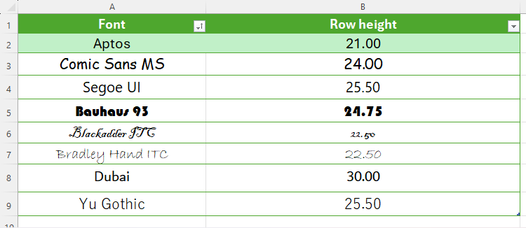
Did you notice that, in the first two screenshots above, rows 7 and 13 were taller than the other rows? This is because some typefaces are naturally larger than others, even if the font size settings are the same. As Microsoft explains, “The discrepancy in font metrics is a function of how Microsoft Windows reports the font information to Microsoft Excel.”
As well as Comic Sans MS and Segoe UI in the screenshots above, Bauhaus 93, Blackadder ITC, Bradley Hand ITC, Dubai, Yu Gothic, and many more will affect your Excel row height, so this is something to consider when looking for ways to present your Excel spreadsheet consistently and tidily. The table below shows various fonts and their respective row heights at 16 pt size. I’ve included Aptos at the top as Microsoft’s default font (at the time of writing), which doesn’t affect the row height.
Using Sylistic Numbers
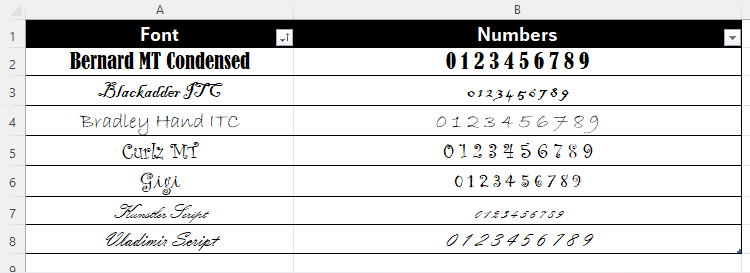
In short, Excel is not the place for experimenting with creative fonts. Instead, as I’ve already said repeatedly, your aim in Excel should be to make your data as easy to read as possible. To this end, using fonts that look as though they’ve been handwritten, have fancy flicks and serifs, or are otherwise stylistic in some way is not recommended. Notice how the fonts in the table below would prevent even the most eagle-eyed analyst from reading the data efficiently and accurately.
Even some commonly used fonts, such as Georgia, have stylistic properties that are inappropriate for serious number-crunching. Notice the inconsistency between the upper and lower edges of the numbers.
On the other hand, the fonts in the table below generally present numbers much more clearly and lend themselves to a friendlier spreadsheet.
So, Which Fonts Should You Use in Excel?
I’ve talked to you about ensuring clarity between numbers and letters, avoiding less accessible fonts, considering how different fonts affect your spreadsheet’s layout, and the appropriateness of artistic typefaces—all of which should contribute to your decision about which font you’re going to use in Excel.
In my opinion, Microsoft has hit the nail on the head with Aptos as the default font for Excel spreadsheets (at the time of writing). It has clear differences between numbers and letters that other fonts might confuse, it’s neither too narrow nor too broad, it doesn’t adversely affect how my spreadsheets behave, and it’s easy to read.
Regardless of my opinion, though, here are some final points to consider:
- Be consistent : Whether you’re typing in a Word document, designing an impressive PowerPoint presentation, or crafting a complex spreadsheet, try sticking to one font.
- Context is always key : Is the spreadsheet for your eyes only? Then, as long as you’re happy, you can choose whichever font you want! If you’re going to share your spreadsheet with your work colleagues, however, then go for a clear, accessible, professional font.
- What does your spreadsheet contain? If your spreadsheet is text-heavy, which font you choose matters less. On the other hand, if your spreadsheet is heavily laden with numbers, your choice of font could significantly affect people’s ability to take your data in.
Even though Microsoft programs come with a long list of typefaces to choose from, you may want to download and add more fonts to that list to give yourself an even more comprehensive selection.


