It might be tempting to jump straight to the fancy fonts when creating your PowerPoint presentation, but hold off for just a few moments! The font you choose greatly impacts whether your slides are the best they can be, so there are a few things to consider first.
Microsoft 365 subscribers have access to more fonts in Microsoft PowerPoint than those who don’t. However, this article applies to anyone using all levels and versions of the program.
Context Is Key
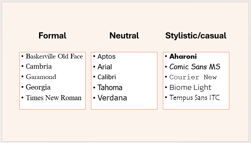
The first thing to think about is matching your fonts to the tone of your presentation. For example, if your presentation is a lighthearted Zoom quiz for your family, you’d safely get away with using a stylistic, casual font, such as Courier New, Biome Light, or (at a push) Comic Sans MS.
On the other hand, if you’re creating an end-of-year business presentation, you might aim for some more formal fonts, like Cambria, Garamond, or Times New Roman, which all have serifs (short strokes attached to the ends of the number and letter stems).
Although I’m not always one for sitting on the fence, I tend to stick with neutral sans serif fonts, such as Aptos, Calibri, and Verdana, as I know they’re suitable in most situations.
Fonts Must Be Easy to Read
Regardless of the tone of your presentation, it’s important that everyone can read it. Also, remember that your presentation might be displayed on a screen in a large room, so you need to make sure that whichever fonts you choose can be read from a distance. Of course, using an appropriate font size is also key, here, but it’s no good using 70 pt if your font is barely legible.
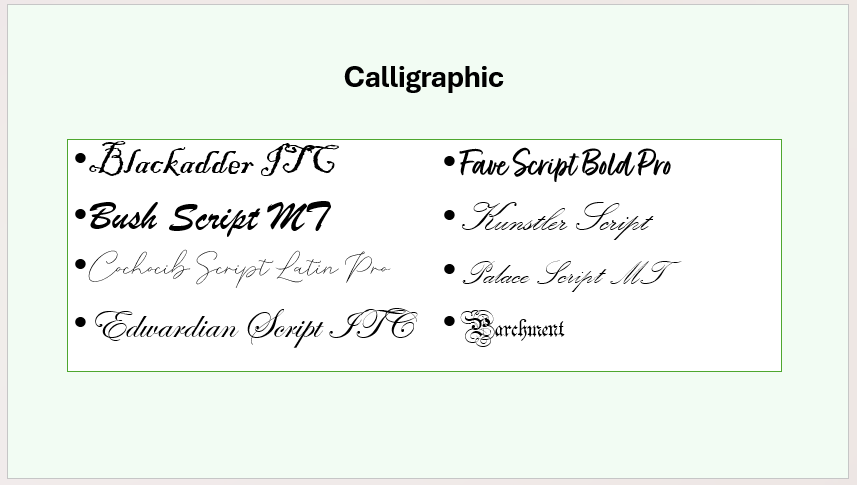
Generally speaking, most fonts are fair game in PowerPoint when the right colors and sizes are used. However, even when ballooned to a massive size, some fonts that emulate handwriting, like Cochocib Script Latin Pro, Kunstler Script, and Palace Script MT, are nearly impossible to interpret at a glance and—in my opinion—shouldn’t even feature on the PowerPoint font list at all.
It’s also worth thinking about whether fonts have serifs and, if they do, whether they make the font harder to read.
Resolution Will Probably Vary
What you see on your computer screen will likely differ somewhat from what your audience sees on the screen when you present your PowerPoint slides. Even if you’re lucky enough to be presenting on a 4K projector, like the XGIMI Horizon S Max or the JMGO N1S Pro, consider the medium on which the projection will sit.
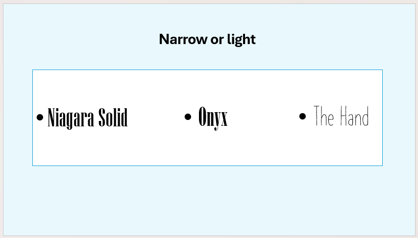
For example, if you’re projecting onto a painted wall, the chances are that less of the light will be reflected back to your viewer’s eyes than on a projector screen. This means that fonts whose letters are narrower or lighter, such as Agency FB, Onyx, or The Hand, won’t be the optimal choice.
Be Consistent
The last thing your audience wants to see is a whole host of chaotic fonts splattered across the screen. Regardless of the context of your PowerPoint presentation, you should aim to be as consistent as possible, with variations in size, bold, italic, and (sparingly) color (also known as visual hierarchies) being the only differences from one text box to another.
As well as making your presentation more professional, consistent fonts also project consistency in you, the presenter, which can be beneficial in many workplace scenarios.
Personally, using the same font throughout my presentation helps me to focus on the content rather than waste time worrying about style. On the other hand, you could use font pairing, which is when you combine two fonts to create a balanced style. In this case, choose contrasting fonts that are weighted and styled differently but share some properties.
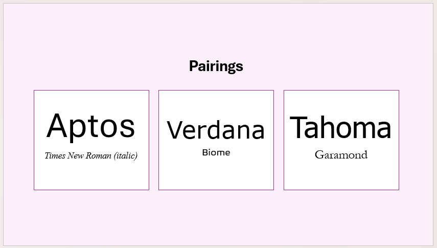
Here are some pairings that I sometimes use, where the neutral primary fonts are complemented by more stylistic secondary fonts:
Aptos and Times New Roman pair well due to their familiarity, with Aptos being the default Microsoft 365 font (as of November 2024) and Times New Roman one of the best-known fonts. Verdana and Biome are both more square-shaped than other fonts, and Tahoma and Garamond are a nice mix of modern and classic, both using the double-story “a.”
So, Which Fonts Should You Use?
My go-to fonts in PowerPoint are Aptos, Tahoma, and Verdana. While these three fit into the “neutral” category, they’re slightly more stylistic than Arial and Calibri, so they present slightly more personality.
What’s more, I believe they’re the easiest to read, due to their reasonable spacing and weight. Most importantly, they’ll display clearly through most projectors onto any screen or wall, and they’ll pair nicely with most calligraphic fonts if I choose to go down that road.
My opinion aside, here are a few things worth remembering when creating your presentations:
- It’s no good thinking about the impact of typeface alone. Consider color and size, too. Ideally, use dark fonts on a light background, and avoid combining certain colors, like red and green.
- The purpose of text in a PowerPoint is to display snippets of information that your audience can read—and, importantly, understand!—as they listen to you speaking.
- Please don’t think I’m shackling you to boring fonts in PowerPoint. Unlike using fonts in Excel and other programs in the Microsoft 365 suite, PowerPoint is a good place to experiment. The program is designed to get your creative juices flowing, so as long as your font is readable and aligns with your tone, go ahead and play around!
PowerPoint’s templates or themes have predefined fonts. To make wholesale font changes, click View > Slide Master, and then expand the “Fonts” drop-down in the Background group of the Slide Master tab. There, click “Customize Fonts” and select the Heading and Body fonts that will work best for you. You can select the same font for both options if you wish.
Choosing suboptimal fonts is just one of the mistakes you could make in PowerPoint. Indeed, misaligning content, having too much text, overusing animations, and using low images are just some of the sure-fire ways to distract, confuse, or disappoint your audience, so be sure to avoid these traps!


