


Linguists argue that emoji are a new, universal form of communication. These small images convey abstract ideas, including emotion and innuendo, with more immediacy than the written word. Not to mention, emoji carry a ton of artistic value; they inspire people to express themselves, much like a painting or song.
Emoji are clearly one of the most important parts of a modern operating system. So, why do emoji look like 💩 on Windows?
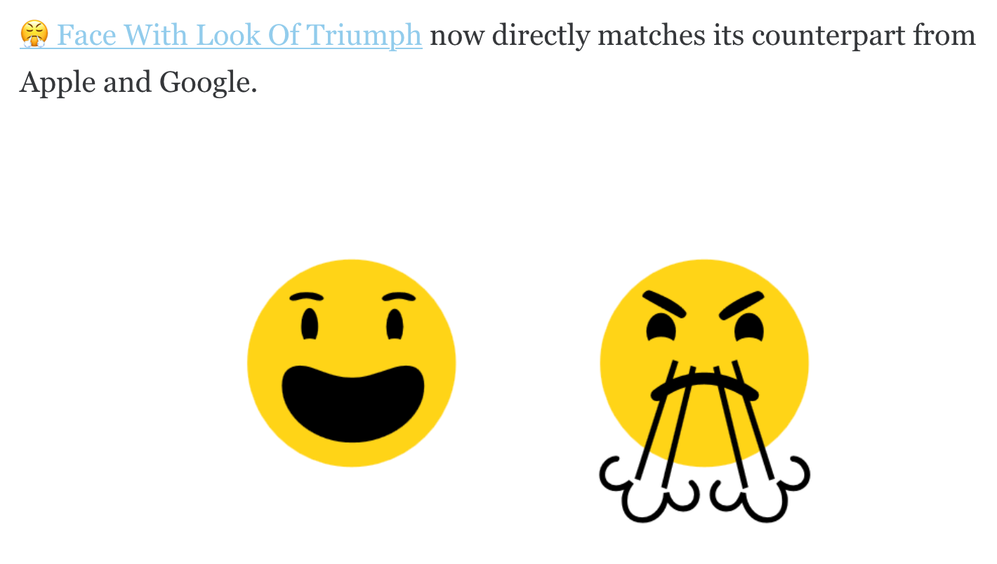
A Tour Through Microsoft’s Terrible Emoji 🤗
Here’s a funny thing about Microsoft’s emoji—they look different depending on what operating system you use. Windows 11 users get a set of strange, minimalist emoji, while Windows 10 users get weird blocky emoji with thick black outlines.
You can see the full list of Windows 11 and Windows 10 emoji at Emojipedia. But I’d like to point out a few of the worst Windows emoji to help put things in perspective.
I will make a single concession to appease the Microsoft fans. While the majority of Microsoft’s emoji are terrible, I really like the shrugging emoji, and the Windows 11 smiley faces aren’t half bad. They’re just missing something … oh, I know what they’re missing! They’re not 3D!
What Happened to 3D Emoji?! 🤬
One of the highlights of Microsoft’s Windows 11 launch event was the long, expensive-looking “fluent emoji” concept video. Microsoft promised that expressive, 3D animated emoji would transform how users communicate with Windows 11—our coworkers at How-To Geek even called fluid emoji Windows 11’s best new feature!
But on October 14th, just nine days after the Windows 11 launch, Microsoft gave us our first look at the operating system’s official emoji selection. A moment that should have been a victory for Microsoft immediately became a scandal. The 3D animated “fluid” emoji had been replaced by ugly 2D turds.
When passionate Windows users argued that they should have 3D emoji, Microsoft denied that it ever promised such a feature. Some people pointed out that the official Windows UK Twitter showed off 3D emoji just days before the 2D emoji launched— but that was just an accident, explained Microsoft.
We haven’t heard of “fluid emoji” since that fateful day. So, here we are, stuck with Microsoft’s terrible 2D abominations. It’s fitting, in a way, because Microsoft has never delivered the emoji that its users deserve.
Microsoft’s Legacy Is Littered By Bad Emoji 🤷♂️🤷♀️
It’s been a long journey. We’ve flipped through some of Microsoft’s worst emoji, investigated the Windows 11 emojigate scandal, and cried over broken promises. But we still haven’t answered the big question; why do emoji look like 💩 on Windows?
Allow me to propose a simple answer. Microsoft has always sucked at designing emoji, and it will continue churning out bad emoji until the end of eternity.
Back in 2015, Insider published an article titled “Why Microsoft Decided That Its Poop Emoji Shouldn’t Smile.” It’s a fantastic piece of investigative journalism that reveals Microsoft’s literal, inartistic interpretation of how emoji should work. As as Insider discovered, Microsoft cared so little for smiley faces that it knowingly ignored the gross similarities between its poop and soft serve emoji.
Windows’ emoji changelog from 2015 also reveals some disturbing information. While other companies chose yellow as a neutral emoji skin color, Microsoft went with … gray. And although Microsoft genuinely tried to make its emoji look more Apple-like in 2015, the results are questionable.
Clearly, Microsoft just doesn’t know how to make good emoji. It would take a miracle, perhaps a 3D animated miracle, to remove the stain of these emoji from Microsoft’s legacy. Let’s just hope that miracle comes soon.
I’d like to end things on a good note, so I’m going to give Microsoft a bit of praise. The company did a good job designing Skype’s emoji. It’s too bad that Microsoft ran Skype into the ground right before a global pandemic and the widespread adoption of Zoom, and all that.


