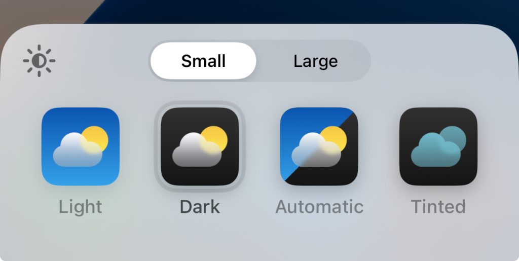
With iOS 18, Apple lets you customize the app icons on your iPhone and iPad. You can choose between light mode, dark mode, or tinted style appearance for your icons.
However, when you choose dark mode icons, you may notice that not all of your icons change. Here’s why that happens …
For the first time, iOS 18 gives users control over how their app icons look on the home screen. The feature has been somewhat controversial as opinions differ on whether the new options look good.
Regardless, if you want your iPhone to be a bit more personalized, you can now edit all your icons to have a different theme. You can even have icons change automatically to light or dark mode depending on the time of day.
How to use dark mode icons on iOS 18

- Long-press on your iPhone home screen.
- Tap ‘Edit’ in the top-left corner of the screen.
- Tap ‘Customize’ in the menu that appears.
- Select ‘Dark’ to choose dark mode icon colors. (Or, Automatic to have dark mode icons only at nighttime).
Why do not all app icons change color?
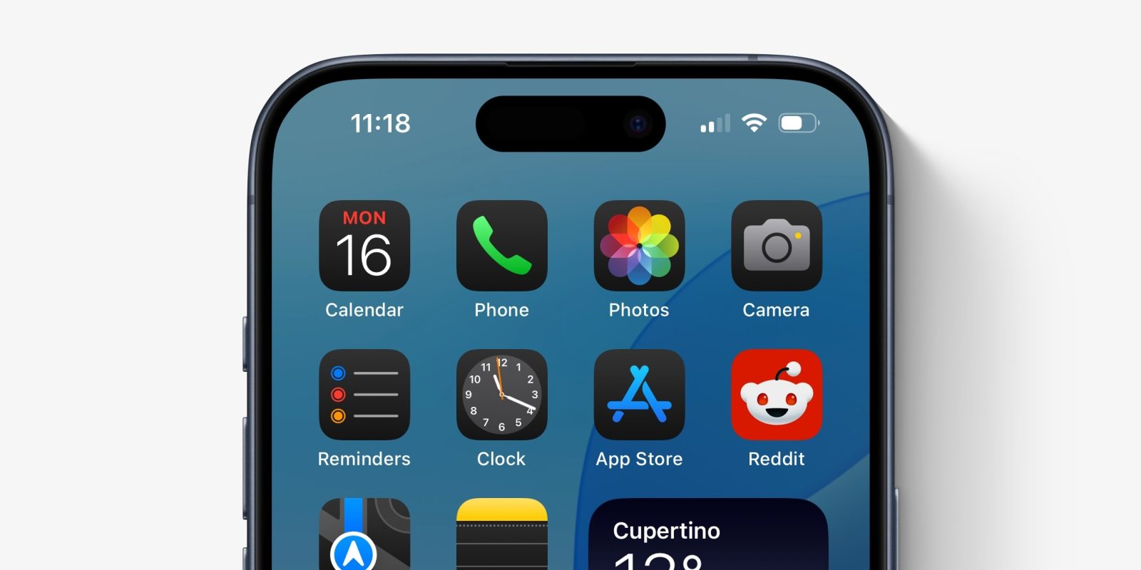
After changing your settings, you may notice that not all of your app icons change to dark mode. For example, in the screenshot above, the Reddit icon remains a vibrant red color rather than changing to a dark palette.
The reason for this is twofold.
Firstly, app developers have to update their apps to include dark mode icons. As developers update their apps to include these new assets, more of your home screen will match. Now that iOS 18 is being released publicly, expect a lot more apps to adopt dark mode icons in the coming days.
If a developer has not supplied a dark icon asset, the iOS system will attempt to render one instead. This is what you see right now with many third-party icons. The iPhone analyzes icons to detect foreground and background elements, and applies a suitable automatic theming.
However, it cannot always do this. The Reddit icon is an example where it fails to automatically separate elements in the icon image, and therefore does not change the colors at all. Instead, it applies a slight dimming effect to reduce how bright the icon appears. But, obviously, it doesn’t match very well when the rest of the icons on the screen are predominantly black or gray.
As a user, there’s nothing you can really do to change this other than to wait. You cannot pick your own app icon images, unless the developer includes custom icon choices already in the application. To get dark mode icons, if iOS has not done it already, you’ll need to wait until the developer releases an app update with the new iconography embedded.
If you choose Tinted app icons rather than the Dark style, iOS applies a different algorithm to change the colors of icons. Tinted icons feature an accent color on a dark black background.
Unlike the normal Dark mode, the tint effect can be applied more universally. So, if you want a consistent look across your home screens, you may prefer the Tinted mode.
FTC: We use income earning auto affiliate links. More.


