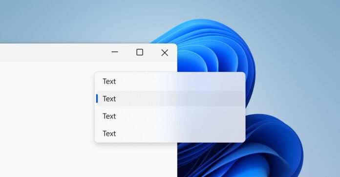
With Windows 11 22H2 “Moment 1” update, Microsoft is apparently bringing tabs to File Explorer. This version of File Explorer apparently uses a new variant of “Mica” material called “Mica Alt”. It’s essentially the same Mica, but there are some noticeable tweaks to better support apps with tabs.
For those unaware, Mica is a new design material part of the Fluent Design System and it aligns the background colour of apps like Settings, Microsoft Edge and others with the desktop. Microsoft officials have already dismissed the claims that the new Mica material could have a negative effect on performance.
With Mica, Microsoft wants to create a “colour hierarchy” and the goal is to distinguish between multiple open instances of the same app. The Mica Alt material, on the other hand, could help distinguish between the opened tabs of the same app. This is another subtitle change and it won’t have any impact on the performance.
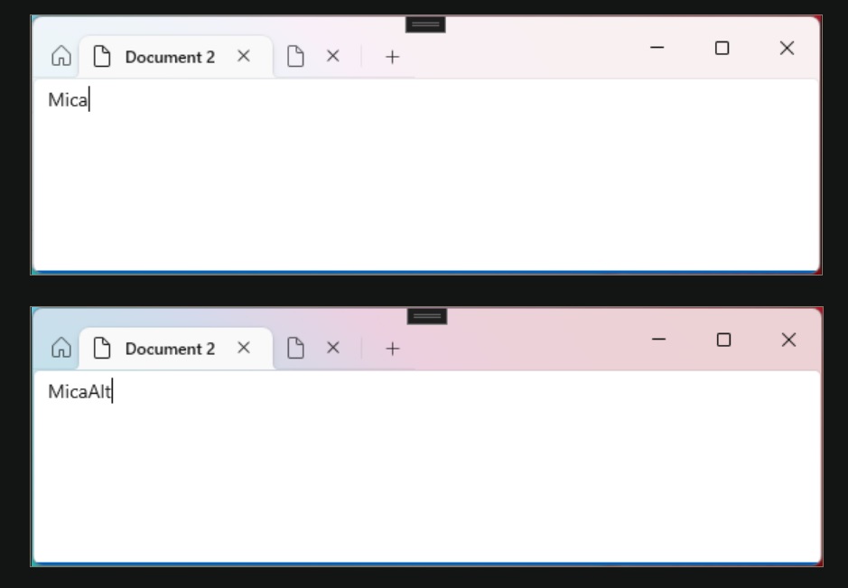
Mica Alt is a variant of Mica and it is similar to the parent design material, but the tinting of the desktop background colour is much stronger as compared to the original Mica. This new visual material provides a deeper visual hierarchy than Mica and Microsoft recommends applying Mica Alt to the tabbed app’s backdrop.
You can spot the difference between the two variants of Mica in the above screenshot.
“Mica Alt is available for apps that use Windows App SDK 1.1 or higher, while running on Windows 11 version 22000 or later,” Microsoft noted.
“Mica Alt is an alternative to Mica as a foundation layer in your app’s hierarchy with the same features like inactive and active states and subtle personalization,” the company added.
Mica Alt can also be used when the app requires contrast between title bar elements and the commanding areas (e.g. navigation, menus).
Mica Alt won’t make your system slower
Microsoft officials added that performance will always remain a top priority for its designer and they want to ensure these new design features are “super fast and don’t impact the OS”.
Unlike Acrylic, Mica is designed for performance and it won’t make your system slower as it saves the image of the desktop background. On the other hand, Acrylic updates the app’s background in real time, which could result in higher resource usage.
Mica and other design elements have already begun to bleed into new third-party app updates and it’s going to be an incremental process.
Microsoft continues to work with developers on the new design ideas and more features will be introduced in the future release (i.e the next WinUI update).


