About two weeks ago, we went hands on with an unofficial leaked build of Windows 11. Now, Microsoft has officially released Windows 11 to Windows Insiders, with many brand new features we haven’t seen before, including entirely new looks for the gorgeous Settings app, File Explorer, the Notification Center, and more. Behind the scenes, there’s even more.
If you’re interested in downloading Windows 11 for yourself, the process is simple: Simply join the Windows Insider program, make sure that your PC meets the Windows 11 compatibility requirements, and then download the Windows Insider beta. In this report, we’ll show you what we saw in the official build, and what’s really new from the leaked beta. Microsoft has also indicated additional features that will show up under specialized conditions, such as after you reset your PC and start fresh.
We tested a fresh install of Windows 11 Insider Preview build 10.0.22000.51 on a Surface Laptop 4, powered by an AMD Ryzen 7 Surface Edition processor. We still have the leaked build running on a separate Microsoft Surface Pro 7+ tablet, though we’re seeing the opportunity to upgrade if you join the Windows Insider program there, too.
We’ve written previously that Windows 11 represents “something more than Windows 10, but far less than what we’d consider a ‘true’ next-generation operating system.” This still holds true. While Microsoft maintains the same functionality in Windows 11 as it does within Windows 10, the look and feel of the operating system has changed. This will probably affect your muscle memory a bit, and your unconscious way of navigating through Windows. On balance, however, Microsoft has made some intriguing improvements to Windows 11.
For reference, here’s our earlier video hands-on of the leaked Windows 11 build.
Windows 11 setup
Downloading the build took about 20 minutes or so on my 400Mbit/s home broadband connection, then required about 10 additional minutes to install and reboot. Because this was an in-place upgrade, Microsoft didn’t show the traditional “OOBE” (Out of the Box Experience), and instead left preferences in place. Microsoft said Monday that if you’d like to entirely reset your PC, you’ll see the new OOBE experience (shown below) as well as something new: the choice to rename your PC as part of the setup experience.
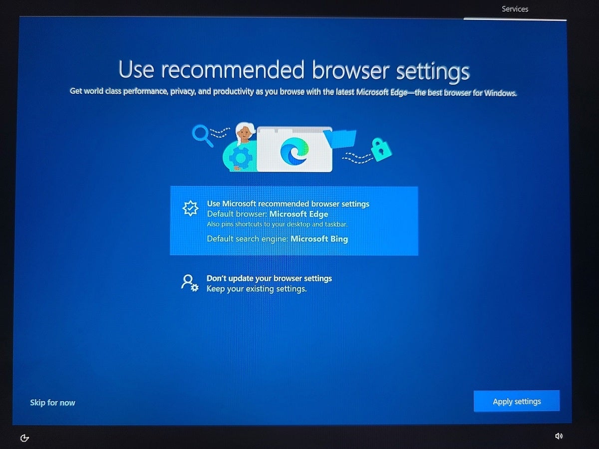
I did see a new screen as part of upgrading the PC to the Windows Insider program, however. I was asked for my preferred browser settings (including search engine) as shown in this screen below.
 Mark Hachman / IDG
Microsoft really wants you to pair Microsoft Edge and Bing together.
Windows 11 first impressions
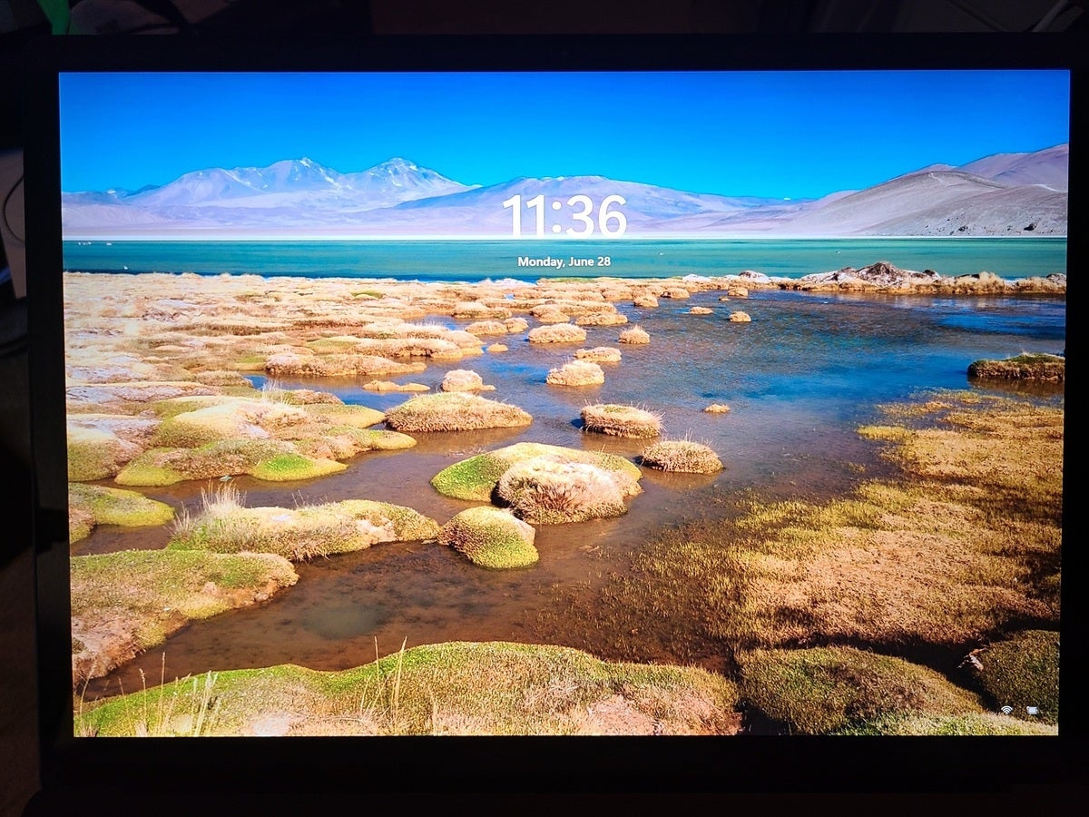
Right from the beginning, Microsoft tips you off that this is a new version of Windows with a new lock screen that employs a different font. Notably, it doesn’t offer any of the familiar contextual text that usually accompanies the Windows lock screen until a few seconds pass. It even looks a bit like a lock screen Google might show you as part of Chrome OS. Microsoft’s startup sound for Windows also returns in Windows 11, with a soft chime that signals you’re ready to work.
 Mark Hachman / IDG
Windows has garnered a certain look and feel over the years. This, however, feels decidedly different.
A quick flick of my finger on the lock screen, and I was into Windows 11 proper. Since I bounce around various Windows laptops, I found that a Minecraft background had snuck back onto my desktop.
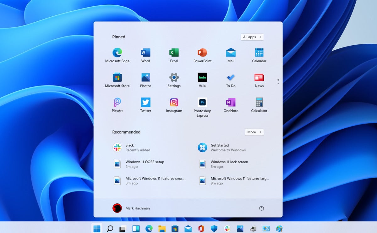
As we revealed with the leaked build of Windows 11, there are two fundamental changes that immediately greet your eye. The first is the centered Taskbar on the bottom of the screen, with a cluster of your most frequently used icons right in the center. The second major changes appears as the very left-most icon: the new Start button, which opens up a simplified version of the Start menu.
The Start menu is still a bit of a shock. Live Tiles have totally disappeared, and are replaced with a list of rather simplified, albeit pretty, icons. Microsoft also clarified what we suspected: The “Recommended” files seen at the bottom of the Start menu are the most recently opened files from your PC and OneDrive.
 Mark Hachman / IDG
Microsoft hasn’t made any changes to the first official build of Windows 11 where the Start menu and Taskbar are concerned.
If this all looks familiar, it should. As we’ve noted previously, Windows 11 draws heavily from Windows 10X, the simplified version of Windows that leaked back in January and that Microsoft later killed. Like Windows 10X, Windows 11 uses the same cluster of icons at the center of your taskbar, with a Start menu that pops straight up from a new Start logo at the left-hand side.
As before in the leaked build, the centered Taskbar can be moved to the left to approximate the look and feel of Windows 10. At this point, we haven’t determined whether Windows 11 allows the hack that re-enabled the previous Live Tiles that were part of Windows 10. Cortana remains missing as a direct integration in Windows 11, though you can launch Cortana as the same app that she was in Windows 10. Where Cortana once lived front and center, the Windows Search icon now stands in. Click it, and the Windows 10 Search widget opens up, offering shortcuts to recently used apps, plus shortcuts to searches Windows thinks that you’ll want to make.
Like in the leaked build, the Windows 11 Start menu can’t be resized, and the background doesn’t offer the sort of translucency and color accenting that we’ve seen elsewhere in Windows. That may change.
Seen for the first time: Settings, Notification Center, and File Explorer
The gorgeous Settings app
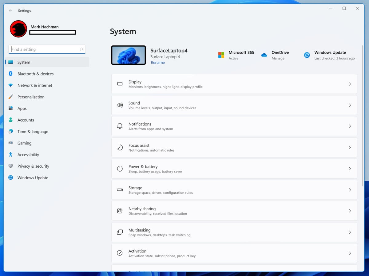
In the leaked build of Windows 11, the Settings menu remained unchanged from Windows 10, prompting insiders to scoff that the leaked build was simply unfinished. In Windows 11, the new Settings menu explodes into visual and functional glory, dramatically changing the look and feel of a familiar Windows application. The index view of the applications now shows your PC at the top, complete with name and model, as well as the status of any updates and whether you’re signed into OneDrive and are up-to-date with Office.
 Mark Hachman / IDG
Windows 11’s Settings is a fresh take on Settings…
Once you start diving into Windows 11’s Settings menu, more changes become apparent. The functionality remains largely the same, but there are small visual improvements literally all over the place. Microsoft UX designers clearly stepped though Settings almost page by page, tidying and making each page more attractive and providing more context on what choices and adjustments you can make and where. But, yes, the legacy Control Panel still exists.
One thing I found intriguing was the Windows 11’s Personalization page, which splashed my PC’s current theme and added six other choices, right at the top of the page. Choosing a darker theme for my PC automatically turned on dark mode, which hasn’t happened before, with most of my default windows fading to a darker color. One exception, however, was Edge. Interestingly, you don’t have to wade through Settings (Settings > Personalization) to change your theme. All you need to do is right-click your desktop and select the Personalize option in the drop-down menu.
 Mark Hachman / IDG
…and Windows 11’s Settings menu starts coming more alive the deeper you dig.
Microsoft has also added new, personalized themes to the touch keyboard, too, which is a first for Windows. There are 13 in all.
Notification Center hides Quick Settings
The lower right-hand corner of your screen has traditionally juggled notifications (i.e., the Notification Center) and the Quick Settings menu. Unless I’m missing a preference or other option, Quick Settings has entirely disappeared from the Windows 11 visual UI. Instead, Microsoft has taken notifications, which still appear to the right-hand side of your screen, and replaced the Quick Settings menu with a small calendar widget that slides out and can presumably be synced to your upcoming appointments. (On my screen, that sync didn’t happen.)
 Mark Hachman / IDG
Notifications still take up most of the right-hand side of your Windows 11 screen. But where did the Quick Settings menu go?
Quick Settings can still be accessed by pressing Win+A, but are much, much more pared down. Most of the functionality has been replaced by toggles and sliders, and even the “gear” icon doesn’t open up the full list of settings that Windows 10 offers. Fortunately, the invaluable Focus Assist toggle can be found within the general Windows 11 Settings menu.
File Explorer gets an overhaul
The new File Explorer is currently unintuitive. That may change as we grow used to the new layout, which, too, has been simplified. At the top of each File Explorer window is a list of icons, some of which will “light up” and indicate that they can be used in certain contexts—copying a file, for example. However, it’s not especially clear what each shortcut does. This may be one aspect of Windows that will take some time to become familiar.
 Mark Hachman / IDG
The new look and feel of File Explorer is more minimalist than ever within Windows 11. Note the row of icons which we’ve highlighted in red.
We now know more about Widgets and Snap
We first learned about Widgets and the revised Snap Experience within the leaked build of Windows 11. Widgets is certainly one of the weirder aspects of Windows 11, while the revised Snap experience is one of the cooler things about the OS. We now know a bit more about them, courtesy of Microsoft.
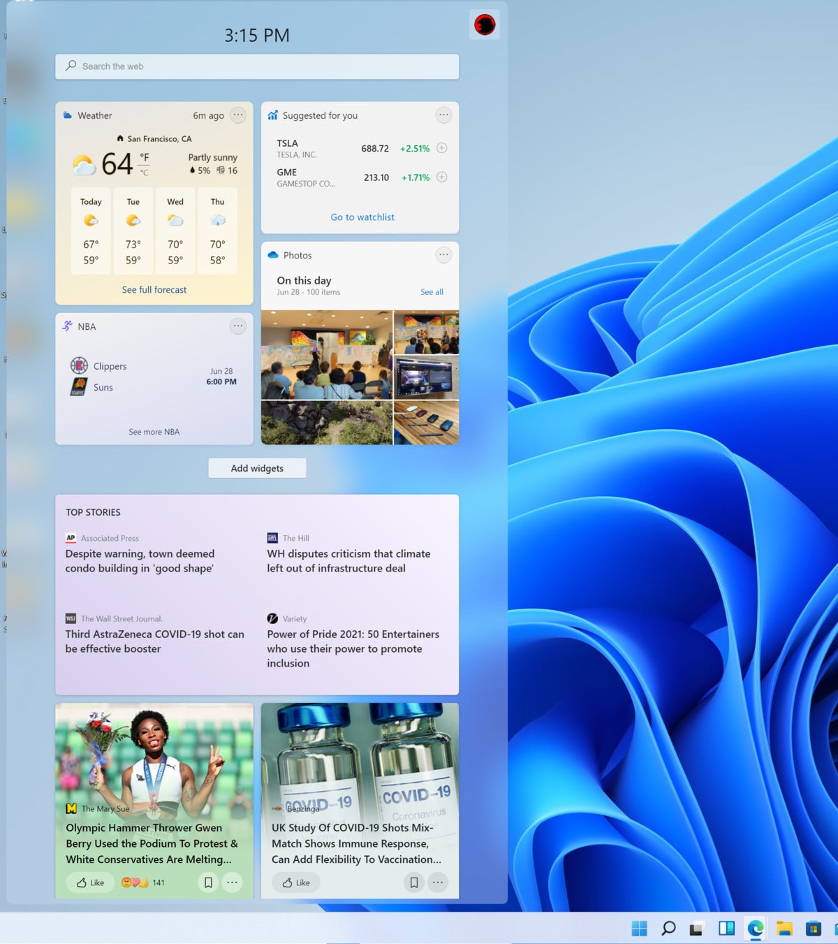
The Widgets button appears in your Taskbar, and slides outward from the left side of the screen to reveal an absolutely massive window of what is essentially Windows 10’s News & Interests. It’s unclear what “widgets” Microsoft will put inside Widgets, but the company tells us that “the set of widgets we provide currently focus on your calendar, weather, local traffic, your Microsoft To Do lists, your photos from OneDrive, sports and esports, your stock watchlist, and tips.” We’re seeing more of this, with individual cards for weather and more.
 Mark Hachman / IDG
Microsoft’s Windows 11 Widgets screen.
It all still looks like just little snippets of information on a variety of topics, but at least they’re configurable if you click your little personalized icon at the top of the Widgets screen. And, no, you can’t resize Widgets, either. There’s also a search bar for searching the web that will open your browser with the results.
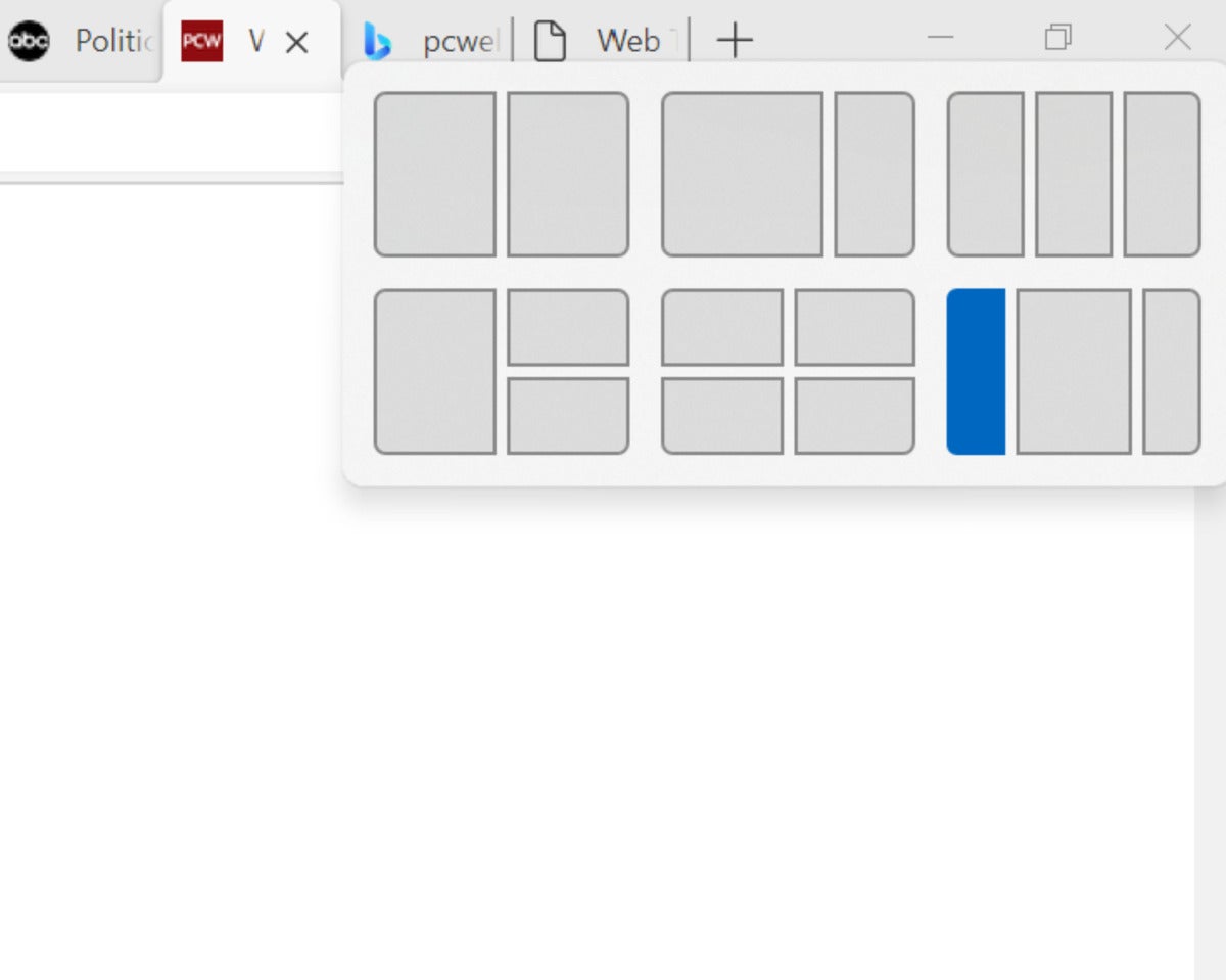
Windows 11’s new Snap experience was clearly influenced by PowerToys, a list of utilities Microsoft brought back for Windows 10. PowerToys includes FancyZones, a way to snap windows not just to the four corners of your screen but to various “zones” on your PC’s screen. Click the “maximize” button on a window, and you’ll see some of those FancyZones options appear again. You can also create Snap groups by snapping together at least two app windows on your screen, then hovering your mouse over the open app and clicking to switch back.
 Mark Hachman / IDG
Windows 11 appears like it’s implemented FancyZones right in the operating system.
The new Microsoft Store app
Microsoft promised us a look at a revamped Microsoft Store app, and in this build we’re starting to see the fruit of its labors. The new Store app looks better, though a visual overhaul isn’t the only thing the Store needs. It also needs better curation, a way to prevent people from downloading apps multiple times, and more. But what we are seeing here includes better organized overview pages and a thoughtful redesign of individual app pages, and more.
The new Microsoft Store app looks more like the Xbox app, with a left-hand navigation pane and the like. It’s interesting, too, that the Store advertises a movie on Netflix, reminding you that, yes, Microsoft still rents and sells movies—which you can find on the Entertainment tab on the Store.
 Mark Hachman / IDG
Famous developer Rudy Huyn is now reportedly architecting the new Store’s look.
Windows 11 under the hood
A number of new Windows 11 features won’t be immediately recognizable—or maybe you’ll just miss them among all of the new visual improvements Microsoft is adding to Windows 11. But the following shouldn’t be overlooked.
Dynamic refresh rate: Surprisingly, this isn’t for gaming, but for inking. If your PC (and laptop or tablet display) supports it, Windows will automatically increase the display refresh rate to smooth out e-ink while you’re drawing on the tablet. You can try out DRR on your laptop via Settings > System > Display > Advanced display, and under “Choose a refresh rate” select a “Dynamic” refresh rate.) Microsoft isn’t saying, however, which hardware will support this.
Voice typing launcher: At long last, Microsoft appears to have started to nail dictation down. You can turn it on by typing Win+H, and you’ll see the dictation widget (which you’ll have to toggle on yourself). I was surprised at how accurate dictation is, and there’s even a setting to turn on punctuation via AI. Even a passage from Pride and Prejudice was dictated basically flawlessly, save for punctuation.
 Mark Hachman / IDG
It’s nothing fancy, but Windows 11’s dictation looks like it will get the job done.
New gestures: Microsoft has added new gestures. Among them are a three-finger swipe down to restore the desktop, and a three-finger swipe up to go to Task View.


