


We have been covering the Start Menu’s recent endeavors in decluttering with new app layouts and a floating side panel for Phone Link. A recent Beta build takes another huge step in that direction, which you’ll surely appreciate, but it eats too much space.
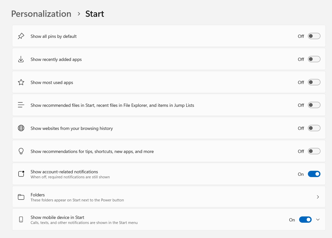
When Windows 11’s Start Menu arrived, it wasn’t big but added an irremovable Recommended section.
That option is going away because we finally have all the toggles to wipe it completely from the Start Menu. Look at the screenshot below, which adds more options to hide everything related to the Recommended section and even wipes the old layout cards.
However, this new effort should have shrunk the Start menu, but that isn’t the case. The All apps section covers a huge part of the Start menu, making it taller and wider than before.
Even at 125% scaling settings, it looks a lot bigger than it should be.
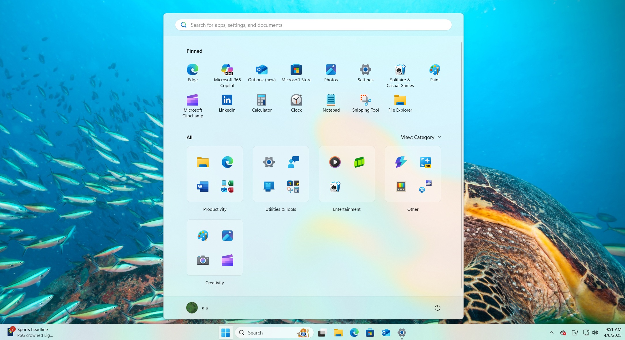
After adding the Phone Link companion panel, you’ll notice that the Start menu canvasses a huge chunk of the desktop.
We hadn’t anticipated this change in the Start menu when Microsoft started experimenting with the layouts.
Start menu covers full screen
Phantomofearth discovered this new Phone Link panel and Start menu style hidden in the Insider build. In the clip, you can see a new phone icon next to the Start menu search bar. You can use it to show or hide the companion panel, even when it’s enabled in the Start settings.

Windows Latest likes this approach because it gives you more control over the presentations. Still, we need the same for the Pinned and All apps sections in the Start menu.
There should be an option to switch between the new combined version or the old version which had a separate section for all apps.
Microsoft could add a setting that could let you adjust the area utilized by the Pinned and All apps section
It could be 50-50 or 70-30/30-70 to make things simpler. Even after adding the new Name Grid layout, a lot of horizontal space is vacant in alphabets that don’t have many apps. Since this is a new Beta build, we don’t think the change is finalized yet, and going forward we expect most users to stick with the Category layout.
The setting idea we suggested above could be in the works or there might be another style Microsoft might be trying. Nevertheless, it’s a win for Windows 10 users who were unhappy with the way they had to click more buttons to see the installed app list.


